
Some Spring Colors I’m Actually Excited About…
This post is sponsored by Nordstrom. All words, ideas and opinions are my own.
Spring usually isn’t my favorite fashion season. So often I find the colors offered this time of year are either too “sweet” or too washed out. But I’ve noticed those rusty tones that were trending in the fall are making an appearance again in this Spring’s collections, accompanied by some really nice corals.
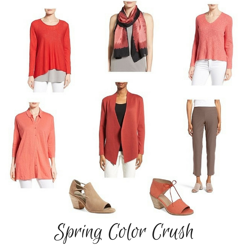
Top row: sweater | scarf | sweater
Middle row: tunic | jacket | pants
Bottom row: tan sandals | coral sandals
Eileen Fisher’s colors can be hit or miss for me, but the colors in her Spring collection are just fabulous. Serrano is a soft, warm, spicy red that combines well with black, brown, denim, taupe, grey, white and ivory. I’ve purchased the sweater in the upper left corner above, and am planning to include it in my travel wardrobe as a color accent. (The color IRL is a bit softer and less intense than it appears online.) Pink Grapefruit is a cheery, soft coral that would pair well with white, ivory, grey, taupe, navy, denim and brown. That linen jersey tunic shown at the bottom left above might be a good warm weather travel wardrobe piece; could be worn as shown or open as a lightweight topper over a tank top. (It’s also available in other colors.) And because it’s a knit, you get the benefits of linen without the wrinkles.
For those who are looking to build a travel wardrobe around neutrals other than black, check out pieces in Cobblestone. It’s a very soft and wearable taupe, with lots of styles to choose from.
Nordstrom has an awesome selection of Eileen Fisher clothing, shoes and scarves. They carry all size ranges (Misses, Plus and Petites), and offer a wide range of color choices for many pieces. Shipping and returns are free. And if you are a Nordstrom Rewards member, you can earn Triple Points now through Sunday, March 26!
A Few Of My Spring Picks….


Stay in touch
Sign up to be notified of new posts and updates from une femme d’un certain âge.
Unfortunately I cannot wear this color at all.
Love the color, but getting totally bored with the EF style, which is beginning to look dated to me. I used to buy a lot of that line, and still wear what I have, but the cost is to high to justify something that is otherwise just what i bought 5 years ago, and I feel as thought the quality of the fabric is not as high as it once was. If i were to buy that color, I would wear it with grey, not taupe.
Having worn EF since the 80’s, I still think she’s on point; – classic shapes with a few trendier / edgier designs. But I agree that today’s fabrics are of lesser quality, a disappointment found in other labels as well. As for spring colours, none really work well for me. The best I can do is to brighten my black/grey/navy wardrobe with white, or accent with a small splash of colour. 🙂
As a person who avoids black in clothing, I am always happy to see suggestions for capsule and travel wardrobes that fit with my preferred colour palette. Thank you!
I have trouble with shoes anymore and need a good padded footbed. The shoes you show are cute but are they comfortable?
Hi Harriet, I have the tan sandals shown (mine are black though) and find them to be quite comfortable. There is padding on the footbed.
I also have these sandals in the black and they are quite comfortable. I wore them for 12 hours yesterday and could have kept wearing them.
I can sympathize about padding in shoes. Just very hard to find. I purchase good quality insoles, cut them so they just cover the front of the shoe and it makes all the difference. I now purchase shoes 1/2 size larger to accommodate the extra padding. They’re easy to slip out for washing and I can still wear my heels.
As someone with spring coloring, I’m actually distressed at the new trend of substituting other palettes for spring colors. I’m especially unhappy with substituting cool tones for warm ones. Spring was one of the few times I could find colors that didn’t wash out my skin tone.
I find that because of my high coloring I need colorful neutrals – navy, chocolate, and rich olive. Taupes, creams, and greys make me blend into the wall. Black overwhelms me to the point that the garment is wearing me!
So unlike you, I hope that they discontinue this trend quickly.
These are my colors so I am extremely excited. And the taupe pants would get a load of mileage. I will definitely add something to my travel wardrobe. Going to Scandinavia next year and I am already wardrobe planning.
I envy you your ability to wear these colors so well; I’ve spent years trying to find a coral that doesn’t make me look as though I have been underwater for several weeks, and I think it’s time I gave up. Maybe I should try coral underwear . . .
Every redhead is shouting YEA !!!!! I’m usually stilling wearing black during Spring due to all the pastels and oatmeal. May be helping the economy very soon !
I like both pairs….but, in black!
Love these colors! I’m one of those who looks dragged down in all the black, navy, gray, etc, that is so ubiquitous and love it when coral shows up as being ‘in.’ Have to make sure I get out and shop a bit this season. Sure wish that gorgeous scarf wasn’t so $$$$$!
Love color! Spring and summer! Refreshing!
You seem to rely heavily on EF, however, there are lots of other designers that are equally if not more inspired for those of us who still take pride in staying slim and hopefully, youthful looking!! A uniform is great when traveling, but it’s nice to think outside of the box for a change. However, attitude and that something “mignon”
Is all that it takes!
Great blog!
I am really coveting that linen cotton EF number. Is the color as bright as it appears? I just ordered something I thought was that color and it was too dark…very dissappointed!