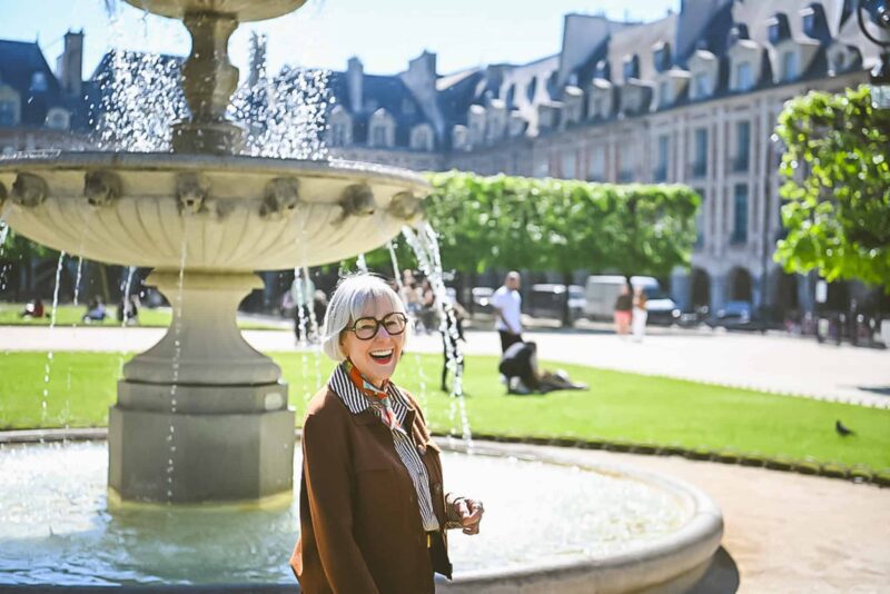
Foulard de la semaine
 Change in color direction…blues, greys and a touch of yellow.
More blues on the agenda for next week!
Edited to add: here’s a picure of the scarf. ~
~
All original content property of https://unefemmenet.wpengine.com
This work is licensed under a Creative Commons Attribution-NonCommercial 3.0 United States License.
Stay in touch
Sign up to be notified of new posts and updates from une femme d’un certain âge.
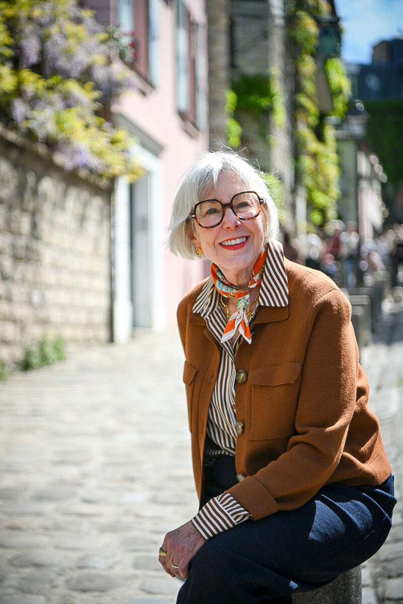
Adds a hint of spring to your outfit!
Bonjour,
Great colors, so soft. I think its kismet, I’m been standing here for the past 10 minutes deciding what would add a little pop to my outfit so naturally I heading to blogland and here you are.
Is this one of the ‘vintage’ carrés? Such gentles colours, without being washed out- a beautiful palette!
What a pretty way to bring a bit of yellow, such a spring colour, into your outfit! It’s not a colour I can wear well, but I think I could wear that — lovely!
That scarf looks a little like a vintage Vera scarf from the 1970s.
Soft and fresh. Yum.
That is a great little scarf,it appeals in both colour and line—I’d love to see it spread out–it’s always so interesting how a scarf drapes. Some that look like nothing when flat, just come alive when worn, and some beautiful enough to frame seem to muddy and disappear as an accessory.
Anyway, very pretty.
I’ll respond to your lovely comments tonight, but just wanted to advise that I’ve added a link to the scarf on the Hermès website in the original post so you can see the whole thing.
Very chic and fresh colors on you!
Love the pattern, and the muted tones.
I bet the people you work with look forward to seeing what scarf you’ll be wearing each day. Lovely.
There is something about those gorgeous colours that makes me think of the Oregon coast line. Love it. Tranquil and misty.
That lovely touch of yellow is a welcome reminder that spring will be here before we know it!
Very charming and chic.
Oh, Hermes! Charming. And horses- the perfect motif!
OOoh; thats a bit different from the usual colours you sport- but I really really like it.Maureen
Hi Deja-Surprise! Please come visit my blog!
This is very attractive, scarves suit you. I like blue and I am really fond of lavender these days. Might go a put on a lavender frock, x
metscan – thanks so much! This scarf is quickly becoming a favorite.
That’s Not My Age – that was the intent, thanks!
Sal – thank you! Thanks to Imogen’s color analysis last year, I’ve learned that muted colors are better on me these days.
Bonjour Romance – merci bien! Scarves are my favorite way to add that pop.
Duchesse – thank you and yes, it’s one of the newer “vintage” offerings. I’m very glad they’ve decided to add more colors and designs in this size, which is often easier for me to wear than the larger carrés.
materfamilias – thanks! I think because the yellow is such a small accent that helps make it wearable. I think these colors would look fabulous on you.
Lisa – thank you!
LBR – thanks. Yes, the colors are very soft and tranquil, and I think they’ll be easy to wear.
Belle – you’re right, it does have that look.
Sue – thanks so much!
Katriona – it took a little doing, but I managed to add a picture of the whole scarf to the post if you haven’t seen it yet.
Style Artisan – the yellow really is a great accent and so cheerful. Reminds me of daffodils. Hope spring comes soon to your neighborhood!
metscan – thanks, thought you’d like this one! I saw another one today with a horse motif I’m now coveting…it’s called “Equestrian” and in the vintage size.
g – merci beaucoup!
tippchic – thank you! Yes, this is a range of colors I’ve not been inclined to wear in the past, but that’s changing.
Faux Fuschia – thanks so much! This one has a lot of a color I like to call “perriwinkle,” sort of a lavender blue.
Daffodil Planter – thank you! Paris and horses are my two favorite scarf themes, but actually don’t have much in the latter category yet.
Horses? For you? A whole new theme 😉
Great scarf, and my favorite by that designer.