Reader Q&A: Tips for Mixing Warm and Cool Colors in an Outfit
A few weeks ago, I mentioned in my subscribers-only newsletter that I’d be adding a regular feature to answer some of your most frequently asked style questions. Today’s the first installment, and I’m sharing some color mixing tips for women, including how to blend warm and cool tones, and even how to “cheat” a little on your color palette.
Why Color Matters
We all want to look our best, and wearing the right colors can be a big part of that. The colors that are in harmony with our skin tone can make us look more vibrant, energized, healthy, competent, and present. In the wrong colors, we can look tired, drained, unwell, a bit “blah,” or even grouchy. Knowing your best colors can help you build a cohesive wardrobe that saves time and money, and makes getting dressed easier. When you are guided by your seasonal color palette, the colors will be in harmony and the pieces can be worn in multiple combinations.
Each person’s seasonal palette will either be warm (yellow-based) or cool (blue-based), though within each palette there are colors that lean toward the warmer or cooler end. Your best colors may be on one end or another, or somewhere in the middle. (e.g. a Blue Spring will look best in the coolest end of the warm Spring palette, while a Golden Spring will be on the warmest end.)
One of the reasons I believe the best color analysis is done in person is because the client can see what I’m seeing: the changes in their skin and appearance as we compare different color drapes. And once you’ve seen the effects of color on your skin, you can’t unsee it. My clients come away excited about wearing the colors that light them up.
But sometimes the heart wants what the heart wants, and you may be drawn to a piece that’s outside of your color palette. I’m a believer in “style tools, not rules” so I’d never tell you not to wear something you absolutely love. (Or maybe there’s a piece in your existing wardrobe you haven’t yet found a suitable replacement for.)
How to Wear a Color That’s Not In Your Seasonal Palette
Reader L. emailed me last week, wondering if I could suggest some tips for mixing cool and warm neutrals in an outfit. And reader Caroline recently commented:
Related to the color topic – What to do if you fall in love with a piece (in my case a coat) that is not “your” color but checks every other box? …do you steel yourself and reject it, or have you found ways to work such pieces into your wardrobe? Would love some examples of the latter!
So here are some general guidelines, and a couple of looks to illustrate.
Wear Best Colors Near Your Face
We always tell new clients that when refreshing their wardrobes, to first focus on getting their best colors near the face. A scarf or top, or even a sweater tied over the shoulders can be quick and easy ways to achieve this.
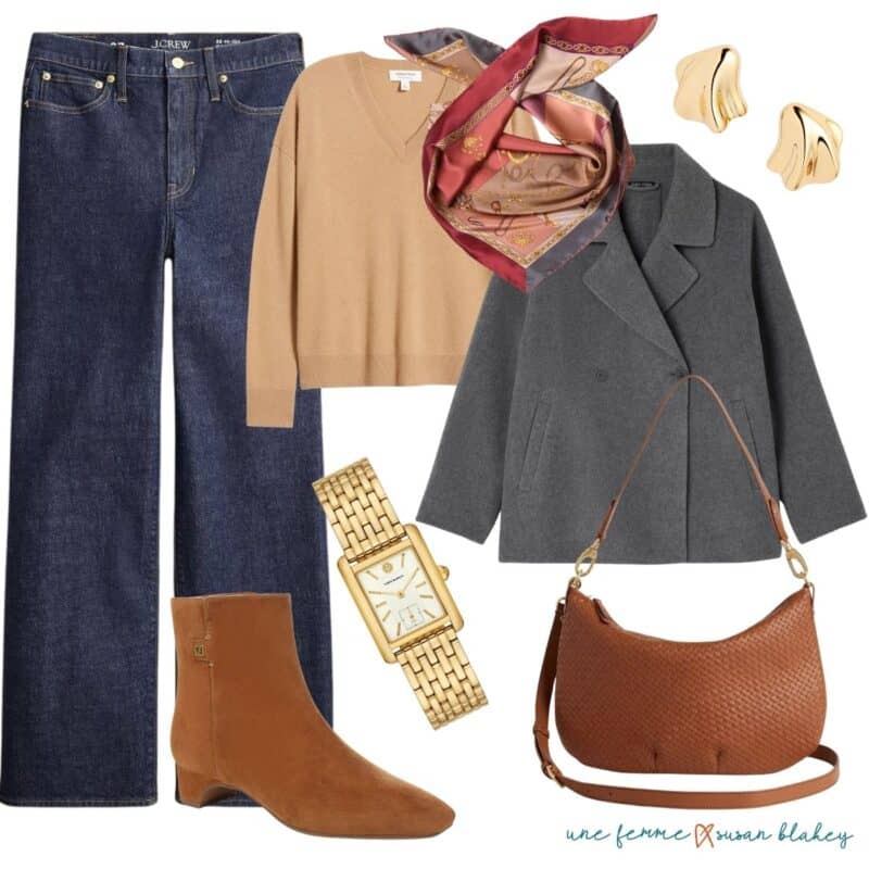
Above, for example: say you’re an Autumn but your favorite fall coat is a cooler grey than what’s in your palette. Add a scarf that’s predominantly in your Autumn colors, but maybe with a little of the “off” color in the pattern. It places your best colors nearest the face and pulls the look together.
Another option is to keep your non-palette colors below the waist, in a skirt or pants. (And remember, I consider most medium to dark denim a universal neutral. YMMV.)
Wear As an Accessory
Bags, belts, and shoes can be another way to incorporate a color that’s outside of your palette.
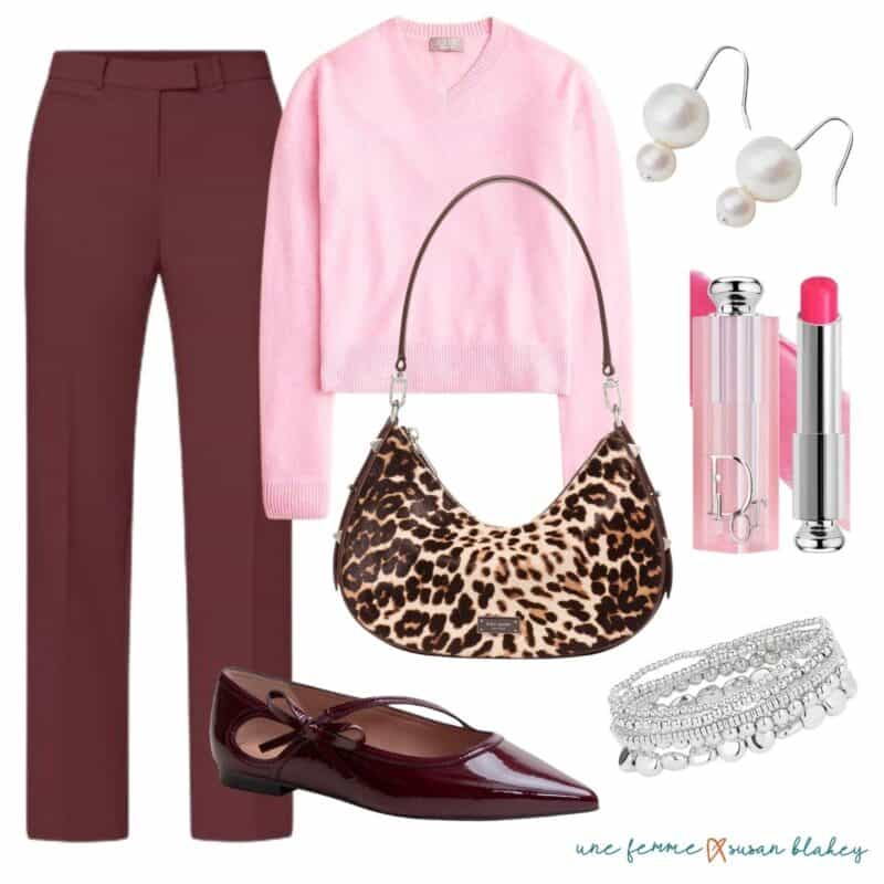
Above, I’ve added a (warm) leopard print bag to a cool palette look. Here, it helps that the hardware on the bag is silver. (I’ll confess, I also consider most leopard print a neutral, especially in accessories.) Burgundy is everywhere this fall, and I think a burgundy bag or shoes can work with warm palette neutrals. Sometimes a clashing accessory adds just the right amount of friction.
A Favorite Tool for Combining Colors
Even if your entire wardrobe is within your seasonal color palette, some combinations may feel more “right” than others. It may have to do with levels of contrast and the energy they project.

This color wheel was developed by Amy Smilovic, the founder of fashion brand Tibi. Even if the Tibi aesthetic isn’t your thing, I find she has a lot of helpful ideas about style and how to create the look or vibe you’re going for.
Working out from the center of the wheel: Ring 1 is black, Ring 2 are neutrals, Ring 3 are what she calls “non-color colors” and Ring 4 are the brights. The further apart the rings are, the more drama and tension between the colors. For example, black (Ring 1) and red (Ring 4) is a very bold and dramatic pairing. But brown (Ring 2) and sage (Ring 3) is a “quieter” and calmer mix.
Whether your palette is warm or cool, the premise holds. So for the second outfit above, the burgundy pants would be Ring 3, and the pink sweater Ring 4. So even though there’s a brightness to the outfit, the contrast doesn’t feel stark.
Color & Contrast
The more natural contrast you have in your coloring (between hair, skin, and eyes), usually the more contrast you can bring into your outfits. But sometimes you just have to play around to find the combinations and contrast levels that feel best for you.
Color analysis can be a wonderful tool to help you evolve your personal style, but it’s not meant to box you in; it’s there to help you make choices that feel intentional and harmonious. Once you understand what works best for you, it’s easier to bend the “rules” with confidence. I’d love to hear some of your favorite color combinations…let me know in comments!
Stay in touch
Sign up to be notified of new posts and updates from une femme d’un certain âge.
Super helpful advice! It opens up some possibilities for me to wear some favorite things that are just outside my autumn palette! Thank you Susan!
I love my (dark) winter palette and it works for me. The colors outside of my palette that attract me most are bright and red orange and darker, blue leaning olive green. This makes sense because dark winter is fall adjacent. I don’t usually wear the orange near my face except one red orange dig walking jacket, but I can wear the right olive because I have dark green eyes that pop with it. I would never buy something as expensive as a coat that’s not in my colors. It will always feel off. Burgundy and pink was a a color combo I adored in high school!
I’m a winter who’s drawn to color. I solve it by having bright handbags and shoes that complement my usual black and navy and gray.
Thank you for your thoughtful response to my question, Susan!
Very helpful suggestions (on the hunt for a scarf now, and maybe a beanie and will look into Tibi.) The idea of adding a soupçon of friction to an outfit really appeals to me; maybe that’s the sweet spot for expressing personality?
If I can amend what I just wrote – “expressing personality” isn’t the right phrase. It seems more that a bit of friction injects a little vibrancy or energy into an outfit…
Very interesting post!
This was an interesting post. I certainly look better in my colours but I have an old tweed jacket that I pull out and love to wear each fall. It’s predominantly camel and grey (as your example colours) with a wee bit of burgundy. I’ll never give up that blazer even though camel is definitely not one of my colours!
I found my progression from winter colours with my dyed dark hair a big wake up call after allowing my full head grey shine. It was a very confusing time as most of my deep and bright wardrobe items wore me.
Discovering there was more softness and lightness about me lead to seeking out many more summer toned colours, a few of which may lean slightly warmer (light spring). There is an almost new soft, cool, red raincoat left that most likely will be consigned as it feels too off no matter what I try with it.
I really appreciate this post….helpful, informative! And I too like a bit of friction, something that adds a “unique me” to the mix.
Btw, could you tell me what color season you would recommend for Brian’s Celeste lipstick?
Thx, Susan!
What a great article – just trying to pack for a trip to Japan and this has helped immensely…
Cheers
Christine
Susan, this is a very helpful post. Thank your for being willing to flex a little bit for those of us who either can’t get a professional color analysis right now or just can’t give up some of our preferred colors. I’m wondering if there are any colors that work well for both a cool or warm person? Not so much a universal color, but one that works for specific subtypes (e.g., “Deep”), regardless or whether they’re cool or warm? I’ve noticed a few colors on the Kettlewell website that seem to work for more than one season but would love to see them on a real person. Thanks!
Thanks for your informative post! You have given me information that I can work with as some times I get frustrated with combining my colors.
I bought a colour ring to get more out of the box ideas but couldn’t work that thing at all and threw it out again.
Greetje
Hi Susan. I had a color analysis done a few years ago and was determined to be “metal/wood.” Any clue how that translates to your system? I’m thinking perhaps winter?
Hi Linda, I’m unfamiliar with that particular color system, so am unable to advise.