To Color and Color Not

I’ve always been drawn to black and white photography and films. The visual reduction of subject matter down to the essence of lights and darks holds more facination and mystery for me than careless color. While color can be used brilliantly to evoke feelings or moods, it sometimes can be too sentimental or overwhelming. I agree with those who were highly critical of Turner’s colorization; to me black and white cinematography is its own art form and should not be adulterated.
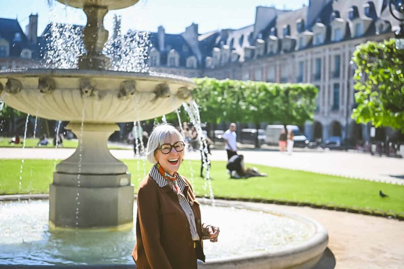
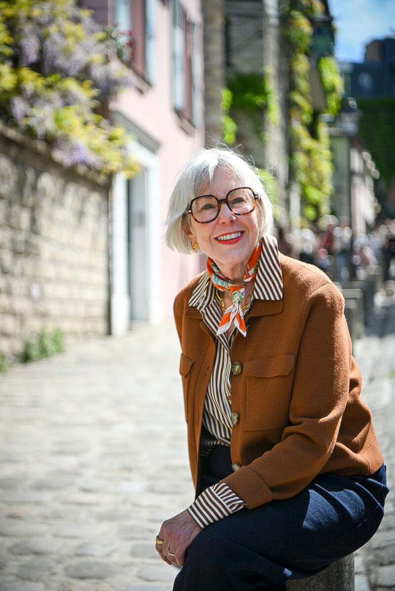
These days I’m most comfortable wearing mostly neutrals accented with color. Even colors I love, when worn too predominantly feel awkward, overwhelming and unstylish. Maybe I’m playing it safer, maybe I’ve been influenced by French style, or maybe I’m channeling my WASP ancestors, but I’ve learned to respect my sartorial comfort levels. I’m thrilled that grey is having a heyday; it’s a perfect neutral that is softer near the face than black, yet can be accented with so many different colors, both cool and warm.
Everyone has their own color comfort level. Making color work for you is more than just learning which colors flatter. It’s also about discoving the colors that speak to your style and the amounts of color that express your vision of yourself.
*edited to add: I should mention that isn’t my e-bay auction.
This work is licensed under a Creative Commons Attribution-NonCommercial 3.0 United States License.
Stay in touch
Sign up to be notified of new posts and updates from une femme d’un certain âge.
Deja Pseu,
Miss Janey LOVES this entry on color. She hopes to see it selected for the Fabulous Festival.
(PS- she could not laugh @ lime green high tops, considering the shoes she wore in the 80s. Hey- that’s what the 80s were for!)
I love black and white photography, too. It can make the most mundane shot look much classier.
I never seem to fit into one of those color categories, anyway (at least, not when I do it from print materials). There’s always a few colors that are supposed to look good where I go ‘really?’, and then a few that aren’t in my recommendations that I love to wear.
Thanks for submitting to the Fabulous Festival!
Thanks, Miss Janey and meg!