How to use the 3-color rule to look put-together
I’m still on a high after our amazing Red Leopard Color Event! Manina from Red Leopard and I just spent 3 days doing personal color analyses for over 20 clients.
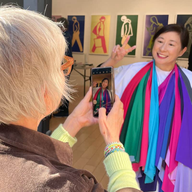
Seeing people come alive when surrounded by their best colors, (and their big smiles) makes doing this an absolute delight! If you’d be interested in a personal color analysis and are in or will be visiting the Los Angeles area, please go HERE for more information and to book your session.
Using the 3-color rule to create cohesive outfits
As part of our very individualized color analysis, we go through all of the colors in a person’s seasonal palette to both find their best colors, and provide suggestions for how to wear them. If you’ve been wearing mostly black or neutrals, adding more color to your outfits can sometimes feel daunting. (Especially when you have so many gorgeous colors to choose from.)
What we advise is to first concentrate on getting your best colors near your face. That can mean a scarf, jacket, or top. Play with different combinations, and see what feels right for you. One formula I’ve found helpful to add color while still looking chic and put-together is the 3-color rule. Aim for 3 colors in an outfit, and yes, your neutrals count.
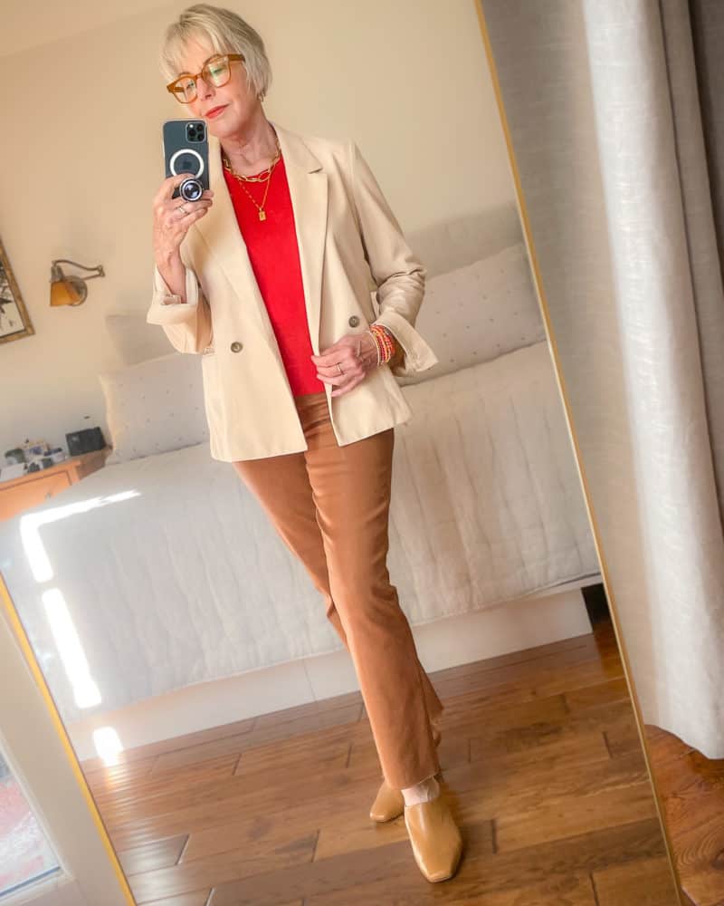
Above, I’ve used 3 colors: tan/camel for the pants and shoes, red sweater, and light peach blazer. (My personal preference is 2 neutrals + 1 color. I’m counting the blazer as a neutral.) That geranium red is one of my best colors, so I’ve added it near my face.

If you’re going to wear something with a pattern, count it as one color. But you’ll want to “pull” from the colors in the pattern for your other pieces. For example, if you’re wearing a scarf with olive, blue, coral, and brown in the print, use olive and/or brown as your neutrals, and pick up either blue or coral as your 3rd color, but not both.
I find this 3-color formula helps me incorporate color into my outfits without feeling like a parrot. 😁 🦜 But as with all style guidelines, my mantra is “tools, not rules.” They’re meant to be supports, not constraints.
Do you have a rule or formula for wearing color?

Stay in touch
Sign up to be notified of new posts and updates from une femme d’un certain âge.
You look fabulous! I like the structure of the jacket and where the shirt hits your hips. Looks neat and tidy but very cool!
Thanks, this is wonderful guidance on color! I never thought about it this way. I tend to wear exactly the same things each day: jeans + something on top, maybe a color, maybe a neutral…nothing creative, definitely not incorporating 3 color/neutral items. I’ll give this a try this soon. Wish I could do a color analysis with you, but I live very far away with no plans to visit LA in the near future. Someday, I hope. In the mean time, thanks for sharing so many photos and stories of your color analysis work, it’s really interesting and fun to see.
Oh, I forgot to mention–wow, that geranium red color is gorgeous on you! The top is stunning–and also the lipstick. (Makes me think of Chantecaille Dahlia.) It’s been fascinating to see your color transformation since your first visit to Red Leopard. You look phenomenal. So inspiring. 🙂
I agree with your statement about Susan’s color transformation. When I first started reading Susan’s blog she was still in the corporate world and only wearing black or navy! That of course was years ago. It’s been fun to follow the transformation, and of course the Red Leopard sessions really made things interesting.
Please say more about the 3-color rule! I’ve never heard of it, but I’m intrigued. For example, in the photo above, if your glasses had not matched your pants and shoes so perfectly, would they count as a color? Is the idea that three colors are all the brain can take in at a glance?
Susan, I think your 3-color rule is very helpful. I especially like that you consider complimentary prints as one of the colors. I find a print, or even textured color, adds much-needed visual impact on me and helps “glue” everything together. Straight color blocking isn’t my best look.
Hi Susan, Do you do color analysis for clients? I live in Culver City and would love to have mine done after the first of the year. I am recovering from lung cancer surgery and this would be a real treat for me in starting the next cycle if my life..
Hi Roseanna, yes I do! I wish you a smooth and speedy recovery. If you’d like to book a session, you can do here: https://calendly.com/susanblakey/personal-color-analysis Or you can email me at [email protected] for more details.
I like the three color rule idea. If you were a summer, what would your colors be? I would probably pick navy as one of the bases.
Sue, it would really depend on the type of Summer you are (there are four breakdowns within each season, and each person’s best colors and combos are very individual). But yes, a soft (not very dark) navy might be a good starting point.
Susan, do you ever have a situation where someone doesn’t really like the colors that would suit them best? I had my colors done a few years ago and at that time was told I’m a Spring but I don’t really like the palette.
Hi Mary, some people don’t love every color in their palette, and that’s OK. Within your “best” colors are probably some you do like and would wear, so those would be the ones to seek out and focus on.
I agree with your rule of three colours. An outfit with only two colours is often a bit boring. I’ll make an exception for a monochrome outfit, but it takes different textures and jewellery to make that work.
And I love colour blocking. Dangerous, out there but so me haha.
Greetje
I looked down at myself while reading this and I’m wearing my favorite colors:
A purple pullover
A teal cardigan
Black joggers with black vans (the black & white polka dot socks are probably a bit much, but I was running out the door for PT this morning and they were handy)
Purple and teal are my favorite colors – I painted my voice studio with 3 walls of teal (really closer to blue, but that’s how it turned out, and it’s fine) and a deep purple wall behind me. My hair was purple and teal for awhile; right now it’s auburn with a streak of teal in the front, and it’s okay, but the other colors feel more like me. They bring out my eyes.
I love the rule of 3! I think it’s very practical. I think it would be a fun post if you showed ways it worked and ways it didn’t so we could see where we might be a bit off track. Hope that makes since.
On another note, one lady asked what to do if she didn’t like the colors in her season. Could it be the season she was given isn’t quite the right one for her? Just a thought.
My rule of 3 is: Dark, Light, and Bright. As a “winter” one dark item, one light item, and one bright item, make a great combination for me. I can even apply my formula to your OOTD. The pants are dark. The jacket is light. And the sweater is bright. Incorporating a pattern into the 3 is harder for me. I see red, black, and animal print combined together and I like that. I try to keep my eyes open for other pattern combinations in a 3 item look. I’ve seen photos of other women combining many patterns together in one look, but I’m more traditional in my choices. I can appreciate a bohemian look on others, but I want to project a more classic look. That feels more comfortable to me.
I like to do a rule of three where it’s 2 shades of a color + 1 different color. For instance Susan’s outfit, to me, would be 2 shades of brown + geranium red.
I dig analogous color schema often used in interior design. This can be applied to clothes too. Look at the color wheel and work with 2-3 adjacent colors. I like blue + purple, or blue + green.
Love that!!
I like the idea of counting a print as one color, then choosing two other colors from the print. Combinations in prints are made with an expert eye.