The Easy Spring Top Formula: Polka Dots, Stripes & Florals
We’ve had an unseasonably warm few weeks, and I’ve been reaching for my summer tops earlier than usual. When it’s too warm to layer, a print top is one of the easiest ways to add interest to simple outfits — no styling gymnastics required.
When in Doubt, Reach for a Print
A great print top does the heavy lifting for you. Pair it with white jeans or neutral trousers and you’re done. Add a sandal, grab a bag, and you’re out the door. That’s the magic of a good “throw-on-and-go” piece — it looks intentional without requiring much effort at all.
This season I’ve been especially drawn to classic prints: polka dots, stripes, and florals that feel fresh but not trendy. The kind of tops you’ll reach for on repeat all spring and summer, whether you’re running errands, meeting a friend for lunch, or heading into the office on a warm day.
(Shopping links are highlighted in red throughout — click any to visit the product page.)
Polka Dots: Playful Without Being Twee
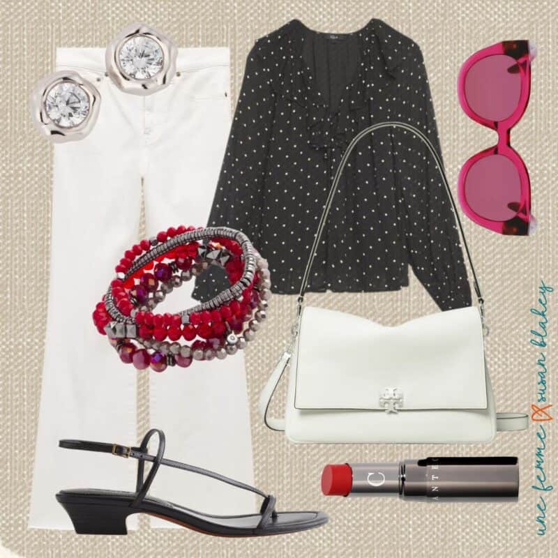
BRACELETS | BAG | SANDALS | LIPSTICK
(Lipstick color shown: Red Juniper)
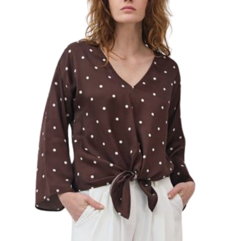
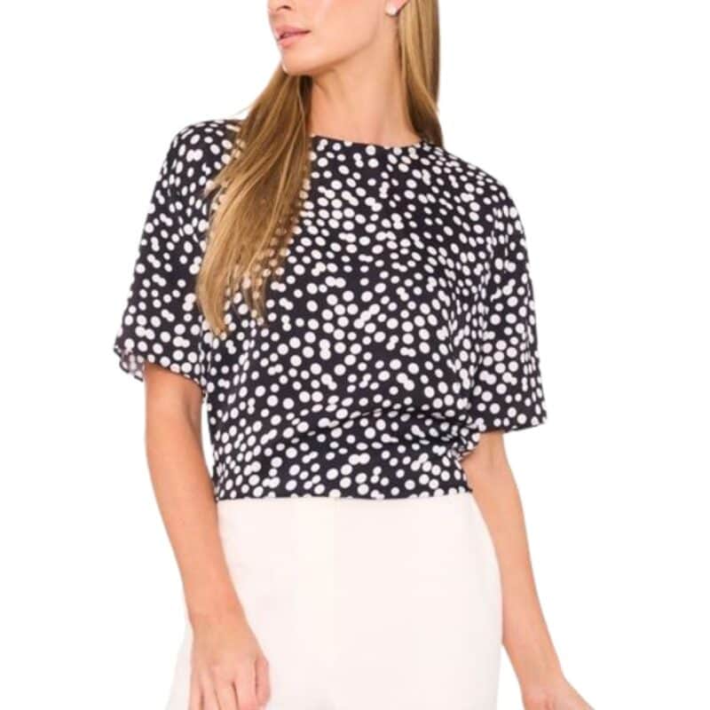
Polka dots are having a moment, and can be as bold or subtle as you like. When rendered in neutral colors, they’re playful without being twee. Here are a few more options:

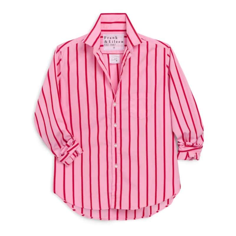
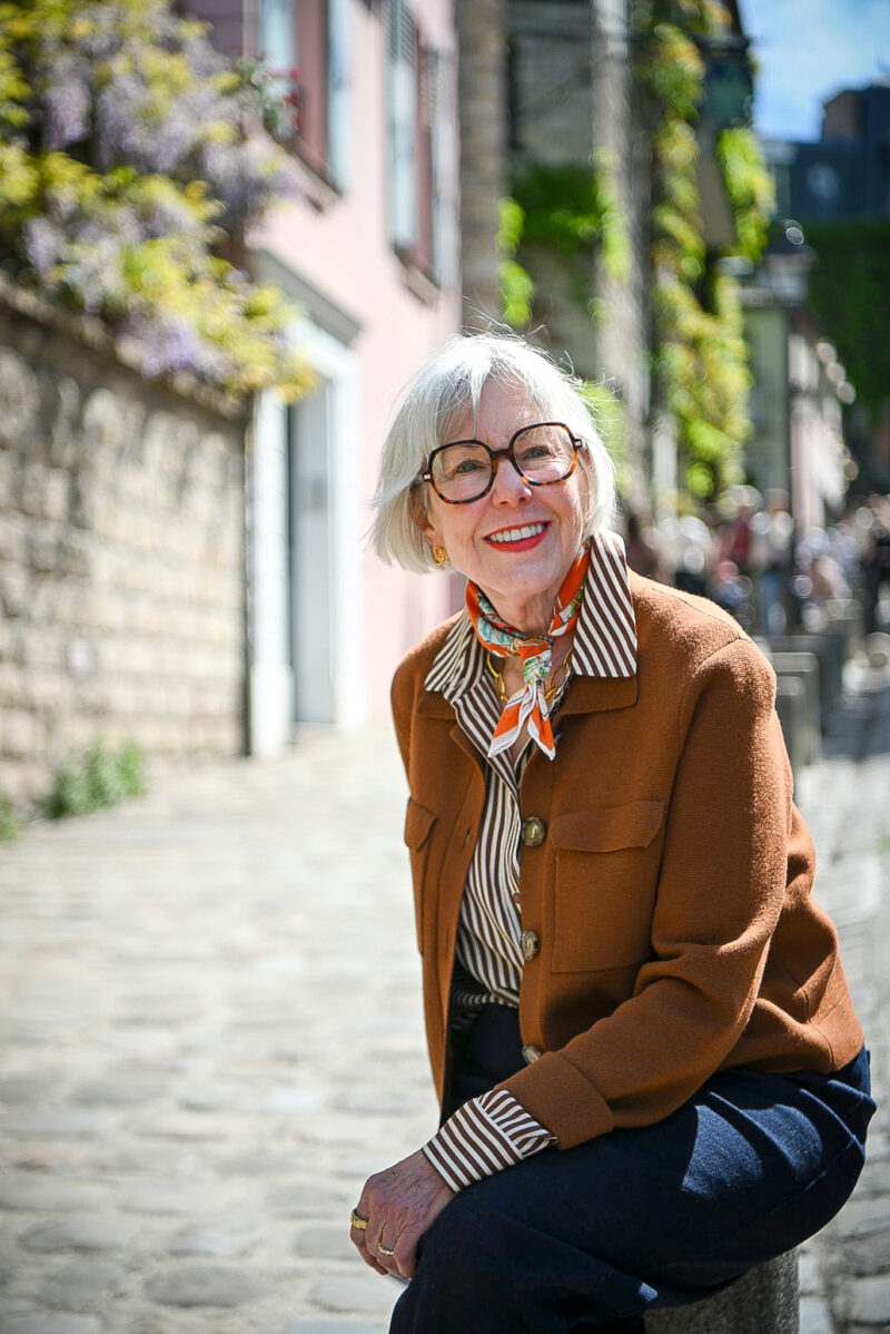
Stripes: My Perennial Favorite

My sizes: Cardigan – XS, Shirt – 4, Jeans – 8 Petite
I’ve rarely met a stripe I didn’t like, and have added a few striped button-front shirts to my wardrobe over the last few seasons. They’re easy to style, and mix well with other patterns. Whether it’s a Breton stripe tee or a collared shirt with vertical stripes, it’s hard to go wrong!

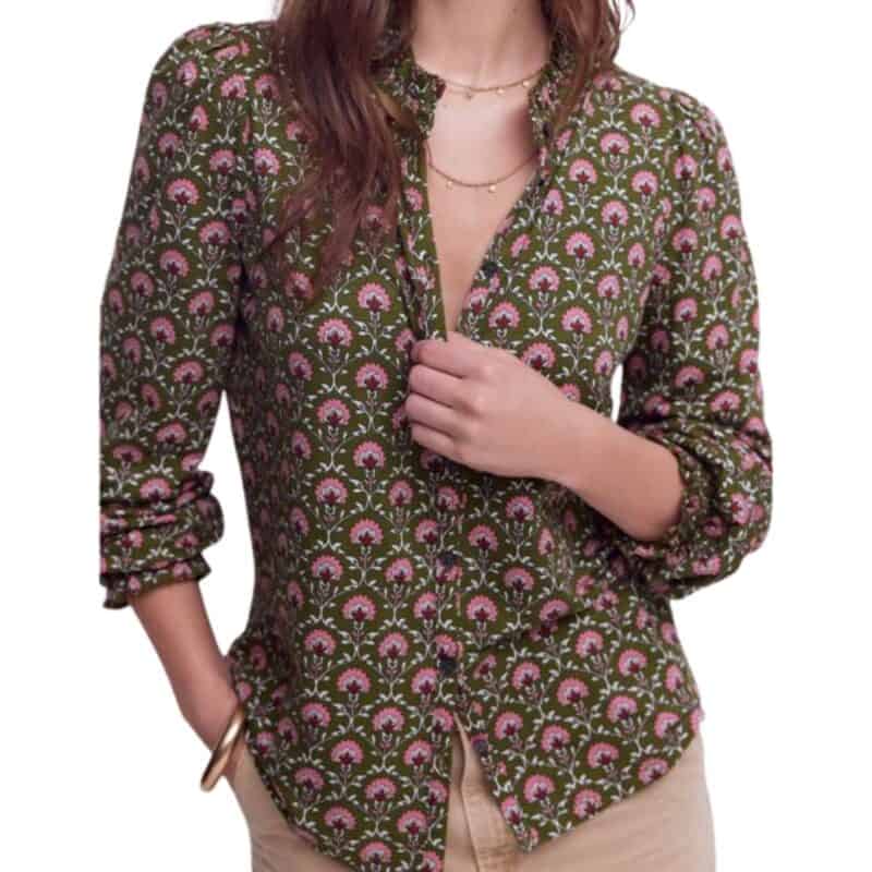
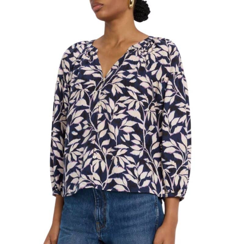
Florals: How to Make Them Work for You
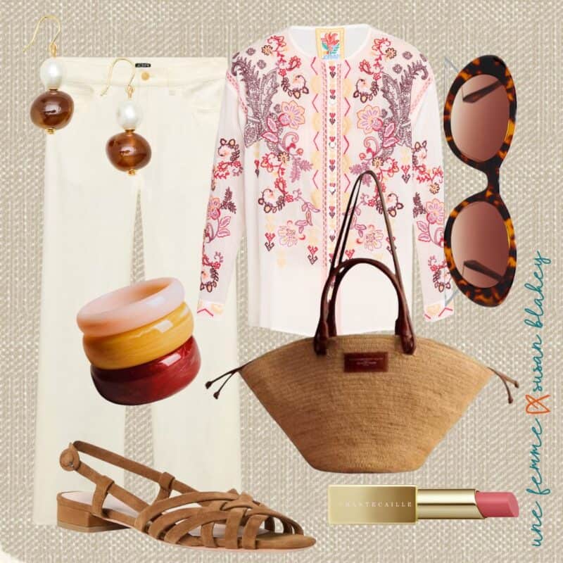
BRACELETS | BAG | SANDALS | LIPSTICK
(Lipstick color shown is “Stella Salmon Pink”)
👉 Style tip: I love the look of floral prints, but find they can be tricky to wear. Too small and they can skew a bit juvenile, too large and they can wear you. I find a medium-scale print with even spacing often works best, and a dark background (black, navy, brown, olive) adds sophistication. Another approach altogether is floral embroidery — like the top shown above — which adds the motif without being overwhelming.

To see more options, visit my collection of Classic Print Tops.
Print tops are one of those wardrobe investments that pay off all season long. Whether you gravitate toward the graphic simplicity of a stripe, the retro charm of polka dots, or the romance of a floral, there’s a print that will work for your style — and make getting dressed on a warm morning feel almost effortless. I’d love to know which is your favorite to wear. Tell me in the comments!

Stay in touch
Sign up to be notified of new posts and updates from une femme d’un certain âge.
Florals. I am petite, and my style archetype is primarily ingenue, so small delicate florals feel very me. I used to wear polka dots, but my coloring – once high contrast – now is low contrast, and I feel they wear me unless they’re tone on tone dots. Stripes, presque jamais.
I also tend to prefer dark background medium sized prints. The problem is harmonizing them with my palette. There always seems to be one or two colors that ruin it. How much dis-harmony is too much? I’ve also come back around to polka dots after disdaining them for years. I’m calling it my neo prep stage…
Hi Shari, my trick for evaluating prints that may include colors outside of our palettes is to squint, and look at the entire pattern slightly out of focus. Overall is there more cool than warm, more bright than soft? Brands rarely follow our seasonal color guidelines, and even prints with some “off” colors can work if they’re in the minority of the pattern.
Wow! This is tricky for me so I always shy away except for stripes that aren’t too wide as I am petite and fair. I finally went shopping two days ago to a major, high end mall and found a lot of florals that were awful to be frank. I’ll continue trying but , all in all, solid colors seem better for me regardless of the season.
Thoroughly enjoy your blog. The weather here on Long Island NY is still too cold for spring layers. Thank you for including items in plus sizes. I’m thinking of the mocha striped tail Road jacket. If it gets too warm, it would be a great fall jacket.
Thank you for pointing out the issues with florals! As a petite I often feel like I am wearing a chintz curtain the pattern is so large! Also although you are wearing a T underneath your striped shirt a cautionary note to others who don’t. When discussing what constitutes ‘trying too hard’ with the twenty somethings in my life the universal eye roll was older women 60+ exposing their bellies! No matter how toned it was a hard no seeing granny’s gut!
Hi Ainsivalavie, I also love a chintz pattern, but in decor, not on me. Regarding you other point, I ask that we stop using “granny” to refer to any woman over 50. It’s a pet peeve of mine, as I find “granny” (or any term that describes a women only by her familial role) ageist and dismissive. We are so much more than that. And I’ve long since stopped letting twenty-somethings set the rules for how I dress. 😉
Touché!
I agree that florals are tricky, although I don’t mind a floral skirt in the summer worn with a solid top. I love stripes, especially Ikat.
Bravo! We need to fight this ageism instead of just accepting it. People are living longer than ever and can be active and productive in their communities for decades beyond their 50’s and 60’s. Society needs to catch up to this new reality; no one should be dismissed just because they reach a certain age or play a certain role in the family.
I love reading your blog and the comments as well sometimes……I think there must be a little psychology going on in our heads on the print issue. I love the stripes on you but when I try I can’t (especially horizontal) I think it’s because of how/what my mother used to dress me in as a kid. Florals and prints have always been hard for me to add (small doses with scarves are ok). I love mixing and playing with color and texture though…….go figure. I’ve always been that way and my younger version loved dressing as much as my retired self (makes me feel good, even if it’s some cool new jeans).
I only have stripes as print tops. I should invest in them. But florals are too tricky for me.
Greetje
I grew up with big bold tropical prints, and still gravitate to them if they are not trying too hard. I have a harder time with stripes, although I admire the clean look.
Thanks for this post, Susan. Love floral print shirts and just getting into stripes.