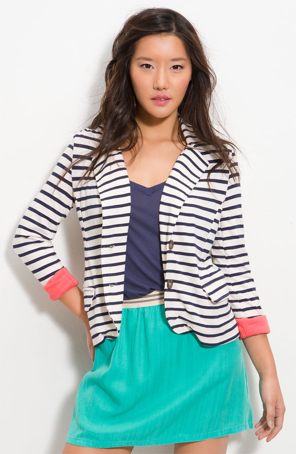
Lately, I’m finding myself entranced by clean, geometric prints. (Yes, even polka dots!) They feel fresh and feminine without being too fussy or frou-frou.
Horizontal stripes or the pea-sized dot: might wear occasionally, for variety. Large, bold horizontal stripes *combined with* colour-blocking scare me, and I remind myself about J. Crew’s target market.
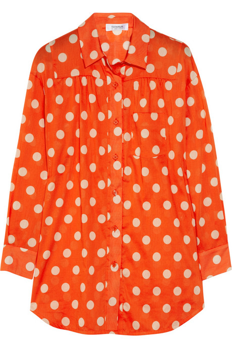
That orange dot Sonia looks witty in the photo but would probably make me double over laughing if I tried it on.
My tastes align with Kathy’s. I have a Target tee that’s black and gray striped. Otherwise? Liberty of London, ikat, etc. I suppose I will never be able to do bold prints and will just have to cheer you on from the sidelines.
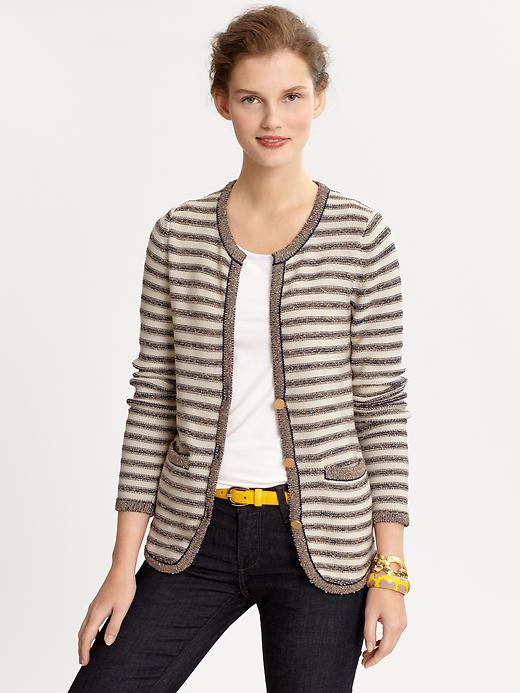
I’ve been reluctantly acknowledging that the idea tends to be much better than the execution on me — I’m becoming increasingly wary of high contrast, although I still love the graphic crispness of bold stripes and dots. Love that BR sweater cardi.
And to ramp it up a notch…I do the polka dots and stripes together! Just not too wide on the stripes, and usually (but not always) in the same color or at least related. Always see polka dots on the store mannequins when in Paree, I think of them as essentially French. Bonne Annee!
I like the idea of the stripes but like Mater, have been increasingly aware that high contrast is not my best look, despite the fact that I am tall. It has to do with the balancing of my coloring (soft) with my temperament (quiet) with my physical presence (tall and more commanding).
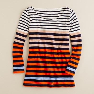
I like the idea of graphic prints in colors that are less sharply delineated. The BR and the Eileen Fisher meet that criteria and I do like the J Crew top, because I see the additional colors as blurring the sharpness of the lines, but it is one of those things that I would have to try. I now live in a town with a J Crew store but I haven’t been there yet and don’t know what subset of the line is available.
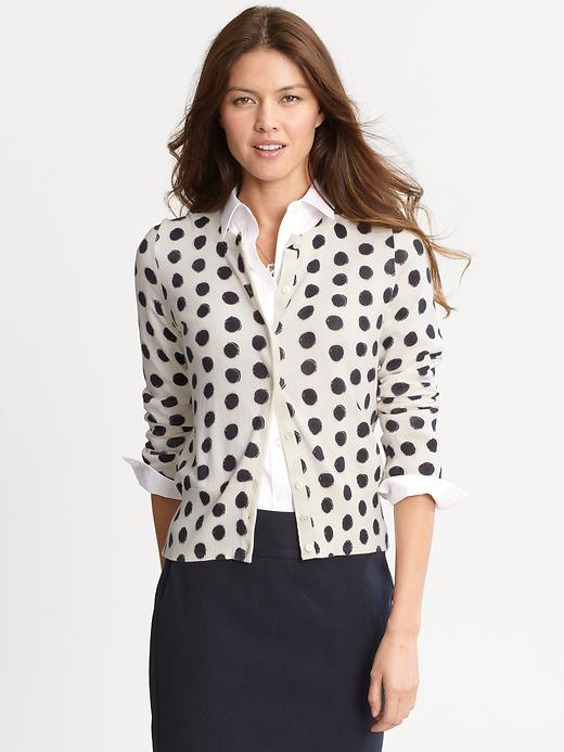
LOVE the polka dots, and tried something similar to the first image but it simply didn’t work on me. Petite and well-endowed don’t accommodate certain patterns very well, unless you wish to appear more petite and well-endowed… also known as short and busty!
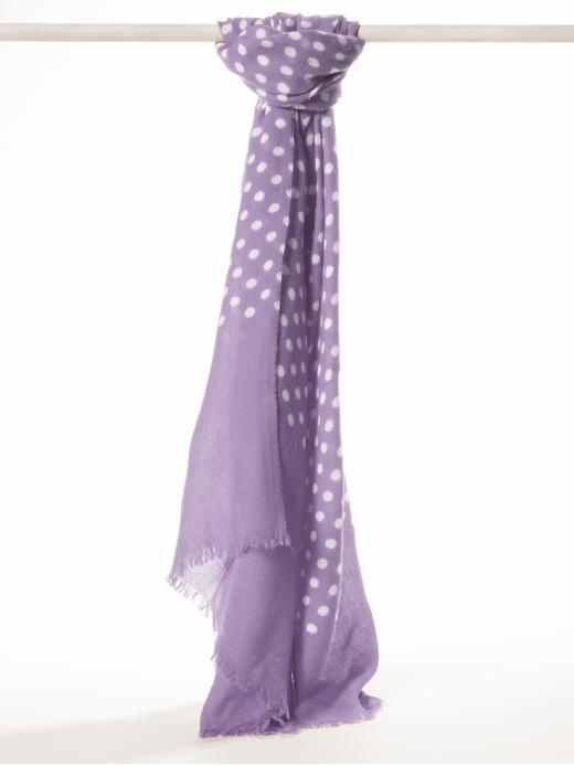
Some stripes and diagonals work well, but it takes care and proper scale. A geometric pattern in a scarf (like the polka dots or anything with bold lines) seems to work better.
I still love some of the classics (which are classic for a reason) – houndstooth in a proper proportion for example.
Maybe there is something in the water or all of the advertising is paying off…but I find myself drawn to prints like this lately as well!! I just have to be very careful with horitzontal stripes, but I love the others and that first polka dot cardigan is so much fun!!
I must agree with the many who’ve said: Drawn to the new high-contrast stripes, dots, etc, but find they just don’t work on me now. So I’m slipcovering a dull chair with a big, bold awning stripe–dark red & white. The fabric makes me smile every time I look at it.
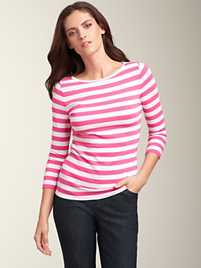
I’ve been drawn lately to horizontal stripes, but they must be one color + white, and the width of each stripe must be the same. So, 1 inch black alternating with 1 inch white. Maybe 2 inch wide maximum, 1/2 inch minimum. The Talbots one you picture is just right, although the pink is iffy.
Typing that out, it seems excessively restrictive, but hey, that’s what catches my eye!
There is also a sweet spot in size/color for polka dots, I just haven’t been able to articulate it.
I’m currently very much into plaid and houndstooth, for some reason. (It’s not just a winter thing– It’s been years since I last wore plaid.)
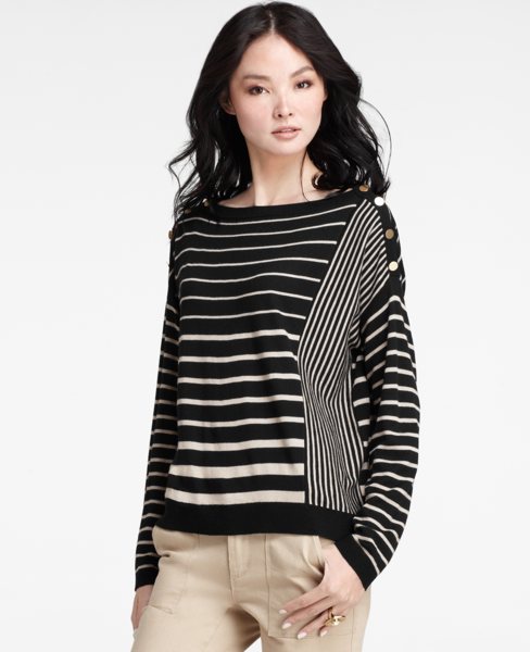
I do love the colors and pattern on that J Crew top. Alas, almost everything I’ve bought from them recently has been returned. I love their colors but the fit is always wrong.
Lovely, my favorite prints! I love polka dots, not too big; stripes are good too. Horizontal is fine in a marinere-style top,always a classic. I can also do a leopard print and maybe a small check, and I love blackwatch plaid, since the size of the plaid is muted by the low-contrast colors. I might be persuaded by a nice paisley as well!
For me= solids. Stripes remind me of jail guys, small flower prints are for small girls, checks a no, no. Dots= soon over. But I like knits with texture, or simple soft cashmere. Tweed gets me excited, as it has the texture. Plain silk= no, taffeta= yes.
After reading you for quite some time thanks to the introduction from Mrs Semi-Expat, I have finally started to delve into the world of commenting in the blogosphere. I could not resist commenting to a post entitled “Warning: Post Contains Graphic Images”!
I love all the ‘graphic photos’ you featured – I have always been partial to stripes; love polka dotted accessories.
I wish the brands were more available in Australia – I’d be shopping right now!
Am I doing something wrong, just tried the BRTAKE30 code at Banana Republic online but it is invalid? Can you help, I love the spotted cardigan and want to buy it.
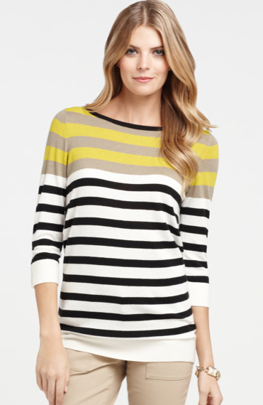

I have bee loving stripes for a while, and those Ann Taylor tops fit the bill beautifully!
I’ve always loved horizontal stripes, but generally I’m a solids girl.
I’m more of a solids chapette too, oh best headline I’ve seen for a long time in blog land !
Horizontal stripes or the pea-sized dot: might wear occasionally, for variety. Large, bold horizontal stripes *combined with* colour-blocking scare me, and I remind myself about J. Crew’s target market.
That orange dot Sonia looks witty in the photo but would probably make me double over laughing if I tried it on.
My tastes align with Kathy’s. I have a Target tee that’s black and gray striped. Otherwise? Liberty of London, ikat, etc. I suppose I will never be able to do bold prints and will just have to cheer you on from the sidelines.
I really like the horizontal stripes. They are so great for layering. I normally do not wear a lot of prints.
Wishing You and Yours all the Best in 2012!
I hope you will enter my Giveaway from Serena & Lily.
xoxo
Karena
Art by Karena
I’ve been reluctantly acknowledging that the idea tends to be much better than the execution on me — I’m becoming increasingly wary of high contrast, although I still love the graphic crispness of bold stripes and dots. Love that BR sweater cardi.
And to ramp it up a notch…I do the polka dots and stripes together! Just not too wide on the stripes, and usually (but not always) in the same color or at least related. Always see polka dots on the store mannequins when in Paree, I think of them as essentially French. Bonne Annee!
I like the idea of the stripes but like Mater, have been increasingly aware that high contrast is not my best look, despite the fact that I am tall. It has to do with the balancing of my coloring (soft) with my temperament (quiet) with my physical presence (tall and more commanding).
I like the idea of graphic prints in colors that are less sharply delineated. The BR and the Eileen Fisher meet that criteria and I do like the J Crew top, because I see the additional colors as blurring the sharpness of the lines, but it is one of those things that I would have to try. I now live in a town with a J Crew store but I haven’t been there yet and don’t know what subset of the line is available.
Solids for me in clothing…stripes and dots and leopard prints in scarves.
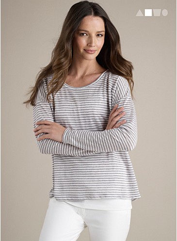
Eileen Fisher could sway me with that top:)
LOVE the polka dots, and tried something similar to the first image but it simply didn’t work on me. Petite and well-endowed don’t accommodate certain patterns very well, unless you wish to appear more petite and well-endowed… also known as short and busty!
Some stripes and diagonals work well, but it takes care and proper scale. A geometric pattern in a scarf (like the polka dots or anything with bold lines) seems to work better.
I still love some of the classics (which are classic for a reason) – houndstooth in a proper proportion for example.
Have you noticed Hermes has new graphic prints?
Maybe there is something in the water or all of the advertising is paying off…but I find myself drawn to prints like this lately as well!! I just have to be very careful with horitzontal stripes, but I love the others and that first polka dot cardigan is so much fun!!
I must agree with the many who’ve said: Drawn to the new high-contrast stripes, dots, etc, but find they just don’t work on me now. So I’m slipcovering a dull chair with a big, bold awning stripe–dark red & white. The fabric makes me smile every time I look at it.
C.
I’ve always loved stripes and just bought a long sweater-dress in multicolored stripes. It’s very Sonia Rykiel and I love it!
I’ve been drawn lately to horizontal stripes, but they must be one color + white, and the width of each stripe must be the same. So, 1 inch black alternating with 1 inch white. Maybe 2 inch wide maximum, 1/2 inch minimum. The Talbots one you picture is just right, although the pink is iffy.
Typing that out, it seems excessively restrictive, but hey, that’s what catches my eye!
There is also a sweet spot in size/color for polka dots, I just haven’t been able to articulate it.
I’m currently very much into plaid and houndstooth, for some reason. (It’s not just a winter thing– It’s been years since I last wore plaid.)
I do love the colors and pattern on that J Crew top. Alas, almost everything I’ve bought from them recently has been returned. I love their colors but the fit is always wrong.
Great headline. I’m a solids girl, but I do like the original French striped sailor shirts, or occasionally small florals (Liberty of London type).
Lovely, my favorite prints! I love polka dots, not too big; stripes are good too. Horizontal is fine in a marinere-style top,always a classic. I can also do a leopard print and maybe a small check, and I love blackwatch plaid, since the size of the plaid is muted by the low-contrast colors. I might be persuaded by a nice paisley as well!
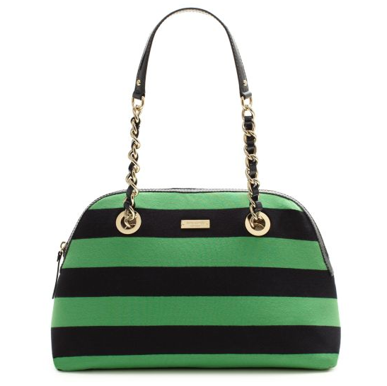
Also, LOVE that Kate Spade bag!
For me= solids.
Stripes remind me of jail guys, small flower prints are for small girls, checks a no, no. Dots= soon over.
But I like knits with texture, or simple soft cashmere.
Tweed gets me excited, as it has the texture.
Plain silk= no, taffeta= yes.
I like solids, but the EF soft striped top appeals to, and there’s something about the Kate Spade bag. It looks like candy.
Like Mater and Mardel I am wary of high contrast.
Re: your previous post, I’m so glad you find blogging to be sustaining and if anything wish you could blog more, not less. Rock on!
The Kate Spade bag reminds me of a Prada dress that I coveted: http://nymag.com/daily/fashion/2010/11/eva_mendes_wore_a_dress_from_p.html
Thanks everyone! I’ll have another post up tomorrow with some lower-contrast options.
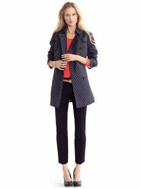
I love the orange/white polka dots! I have many polka dot scarves, so accessories are my main expression in this area.
Hello and Happy New Year, Déjà Pseu!!!
After reading you for quite some time thanks to the introduction from Mrs Semi-Expat, I have finally started to delve into the world of commenting in the blogosphere. I could not resist commenting to a post entitled “Warning: Post Contains Graphic Images”!
I love all the ‘graphic photos’ you featured – I have always been partial to stripes; love polka dotted accessories.
I wish the brands were more available in Australia – I’d be shopping right now!
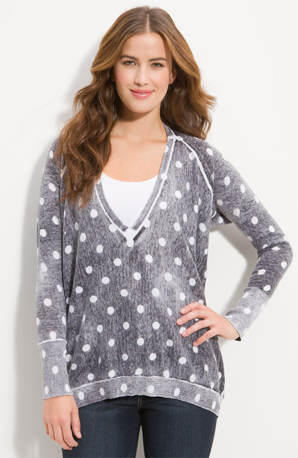
Polka dots have been my go-to geometric shape the past few months. Love the second photo and the Eileen Fisher top.
Am I doing something wrong, just tried the BRTAKE30 code at Banana Republic online but it is invalid? Can you help, I love the spotted cardigan and want to buy it.