There’s a New Look at une femme d’un certain âge
Update: as you may have noticed, we have restored the prior homepage design. I appreciate the feedback, and we’ll take all of it into consideration when making modifications to the design.
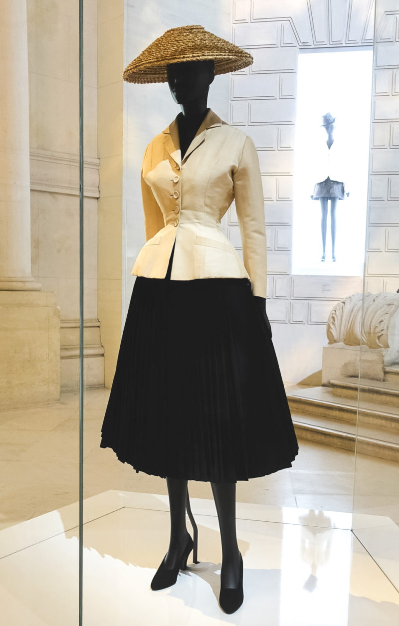
No, not that New Look. 😉 👗 But it’s one that I’m delighted with and think you’ll like…
Over the last several weeks I’ve been working with a design team on updating my HOME page and it’s now live! I wanted to create a centralized resource to help you find the articles and content of most interest to you at une femme d’un certain âge. I’ve done my best to make it easy to read and navigate, and thought I’d give you a little tour.
une femme’s “new look”
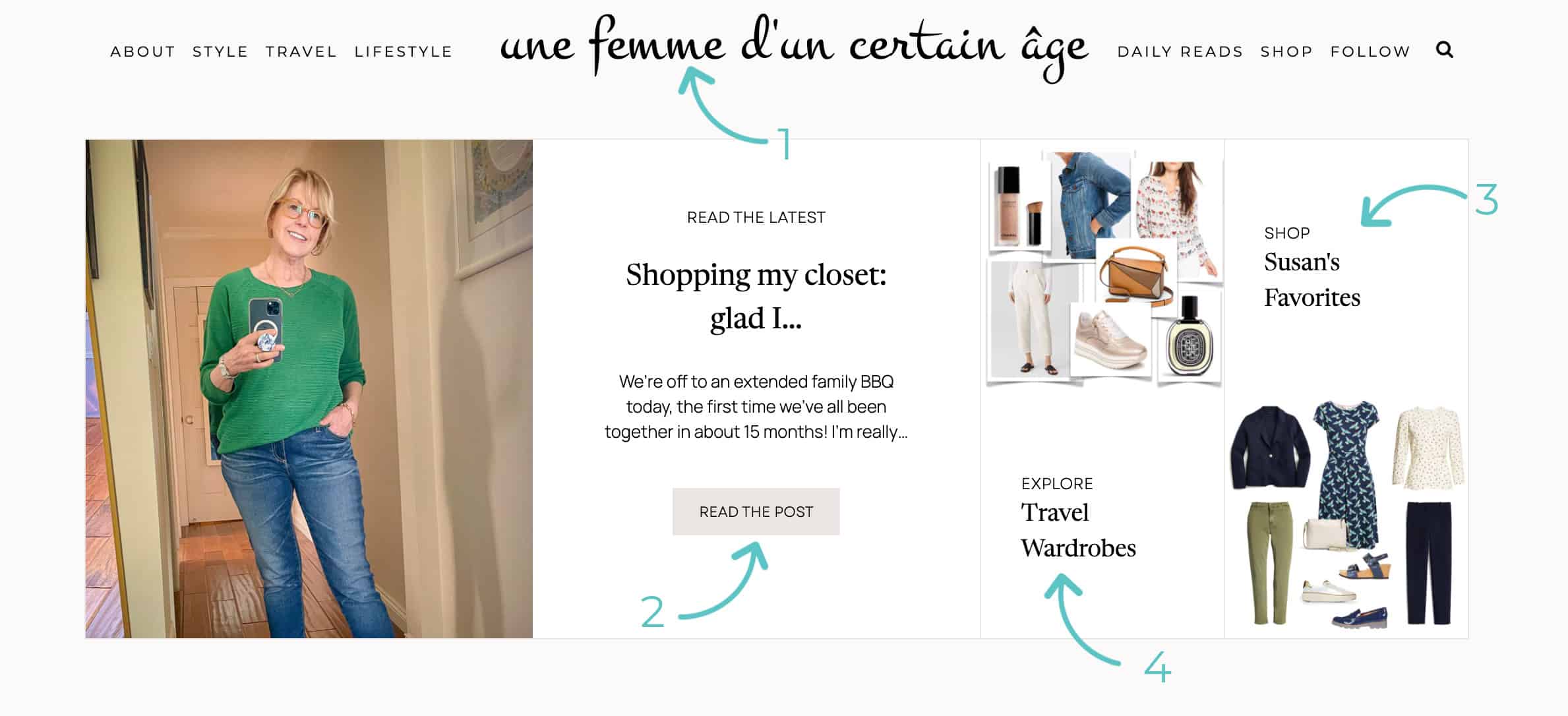
Starting at the top, you’ll find the menu (1) to navigate to various categories and pages. Clicking on my logo will return you to the home page from anywhere on the blog. Searching for something specific? Just click on the magnifying glass icon in the upper right corner, and type the keyword(s) for your search, and hit enter.
Next, you’ll find the most recent blog post (2). Then shortcuts to my SHOP (3) and Travel Wardrobe Resource (4) pages. (Just click on text to navigate.)
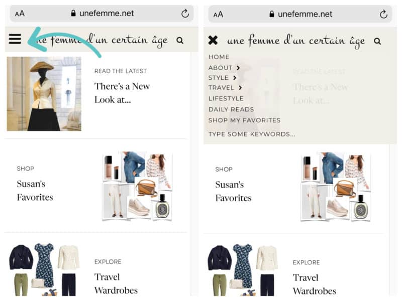
(On the mobile app, the menu will look like this….just click on the “ladder” to expand the menu.)
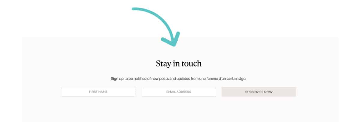
Scrolling down, here’s an easy form to subscribe to my emails and weekly newsletter with exclusive content for my subscribers. ✨ If you haven’t yet subscribed, it’s the most reliable way to be notified of new posts and updates!
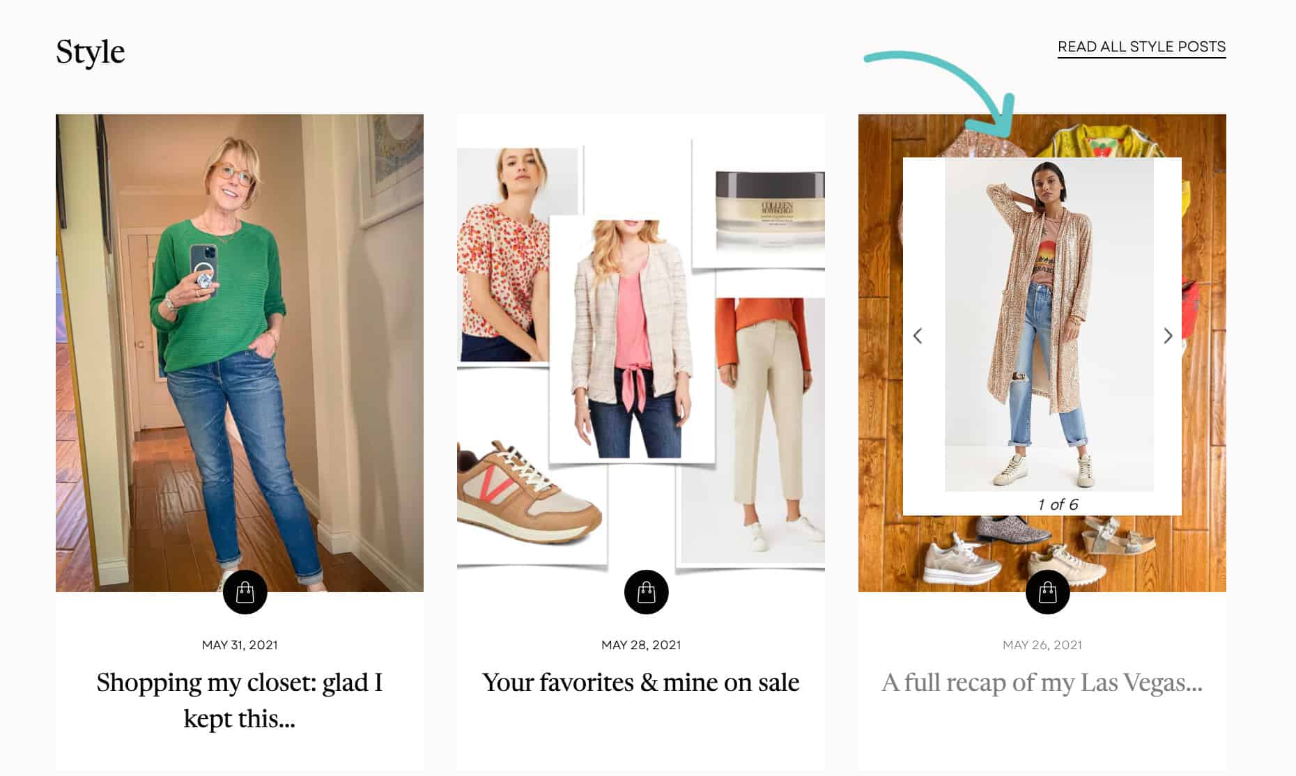
Next, the most recent posts in the Style category. You can click on the title to read the full article, or if you hover over the center of each image, a popup will appear with linked product details. Or you can click on Read All Style Posts (upper right corner) to peruse the archives. (Further down you’ll see similar sections for the Travel and Lifestyle categories.)
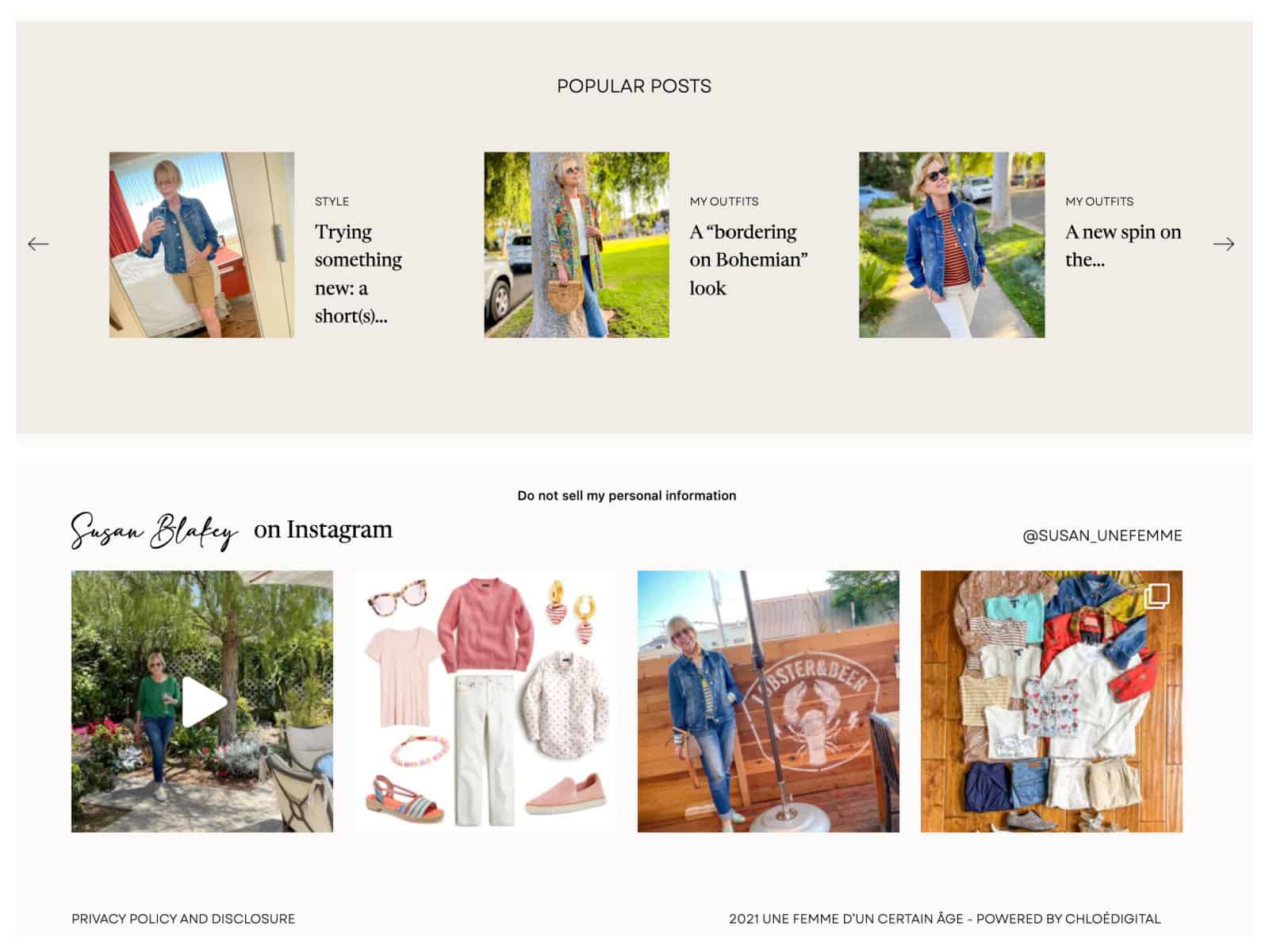
Want to know which posts have been most popular with other readers? Scroll down POPULAR POSTS (and use the arrow keys to see more options. Finally you can see what I’ve been posting lately on Instagram.
So go have a look! We’ve tested (and re-tested) all of the links and functionality, but if you see anything that doesn’t seem to be working correctly, please let me know!
Stay in touch
Sign up to be notified of new posts and updates from une femme d’un certain âge.

Looks nice but much harder to read because of the smaller print. I’m on an iPad and if I enlarge the print I can’t see the entire line of print unless I move it from side to side.
It is really difficult to read on an iPad. I checked older postings and no such issue. May want to check on that Susan. I would think many readers use iPads and this is simply minuscule. I hate to say you will lose me as a subscriber but eye strain isn’t worth it. The font needs to be larger. Also enlarging and moving side to side, so annoying. Glad I am not alone..the eyes aren’t what they used to be.
The blog posts themselves have the same type and font size as always. I’ve asked the designer to see about increasing the font sizes on the home page.
While your explanation helps me understand the intentions, I agree with the previous comment. I read on my iPad and I find the font very small and the overall impression quite full, almost cluttered-looking.
I loved seeing your new layout. I’ve always been interested in formatting pages and. How you can draw the eye to something you want to share.
Reading the comments, I do see that many found the font was too small. That’s frustrating for you to hear, I’m sure, but a very important observation.
I remember my bank came out with a new format several years ago that I just could NOT read with out difficulty (and I was younger then!)
I complained to the bank, but no changes were made… for about a year. Then they made the font size adjustable. I think that they should have listened to me, of course!
BUT there may be enough of an outcry, kind and caring, of course, to make a change.
Here is a “typical old person’s comment”: webdesigners are probably wonderfully creative, but NOT as old as your readers.
Good luck, and I will continue to enjoy your content.
Susan – check with your web developer to ensure your site was made with “responsive design” – that’s what allows your site to scale to fit different formats (phone, tablet, desktop, etc)
The print is way too small. It is a struggle to read.
Can’t read the tiny print on my iPad 🙁
I, too, am on an IPad~ yet thus far the font is okay for me. All that aside, congrats on all your hard work and centralizing each of your terrific subject matters. Everything was nice before, this “new” look is crisp and enhances what you diligently strive to share with us. It all looks great
It functions on my Samsung galaxy tablet but that’s Android not Apple as commented by tbe previous comments. Maybe that’s the problem, But, the font is very small, and faint. Not an easy read for we women of a certain age. I like the font style, just not the size or density.
Sorry to add to the problems, but the navigation menu at the top doesn’t show up on my iPhone.
Susan,
Your new format is also not fitting properly on a kindle.
Looking forward to using your new design once it is adjusted!
It works great on my Android tablet. So far, I like the new format! I will continue to poke around and explore.
Navigation menu doesn’t show up on my android phone.
This is regarding the readability of your blog. For aging eyes and lower vision, darker and larger font would be most welcome!
Hi Susan, appreciate the hard work that went into your new format. I agree that the font would be lovely a bit larger and darker.
Even with my glasses, I’m finding the smaller, lighter print more difficult to read.
I agree with Sharon. Darker and larger font would be most welcome.
I cannot search within the style category for a particular type of item, e.g., bags. Am I just inept or is that not possible? If the latter, this function is useless.
Hi Nancy, if you click on the Search function (magnifying glass icon) and type in “bags”, you’ll see all of the bag-related posts. This should work from any page or section.
Im reading on a PC so have no issues with the font size. I am finding the new look to be less easy on the eye though, somewhat disorganised, certainly less attractive than your old layout. The new post on the home page has far less impact now. With that said Im sure we’ll all get used to it.
Thanks everyone for the feedback! I’ve passed along to the designer to make adjustments wherever possible.
In addition to the font size, I would like to be able to easily look for past posts by date. For example, if I know something was in April, I’d like to be able to find the April posts. Or if I want to refer to something a few days ago, I want to find it quickly–even being able to click through horizontally at the top would help, instead of the most recent three posts only.
Something else I’ve always wanted: I wish links would allow me to open them in tabs instead of new windows on top of the post (I mostly use a web browser, not an iPad). I prefer to open links in tabs as I read through, looking at items after I read the entire post. Popping up in new windows disrupts my reading.
It is very clean and bright and uncluttered.
I’ll have a good time navigating through your “new look”. It looks to me that the small print is NOT actually small print, it is small because it is being used as an example, people should not be worried about trying to read it at this point. The blog is not exactly new, it’s just easier to navigate; I love that you have the search feature as there have been several times I wanted to search for something but couldn’t find a search feature. I LOVE your blog; it’s the first & only I have followed; I have found out so much about myself from your experiences. I’m glad you got to go to Vegas for a long weekend; we haven’t gone anywhere since Christmas of 2018! It is about to kill me not to travel! We will be going to Dallas in October to see my step-son then we are planning to fly up to Washington State to visit Seattle (We’ve only spent a day there before we got on an Alaskan cruise but we didn’t get to explore up there) so we’re looking forward to that. Maybe in late 2022 we can go overseas or at least a few places in South America. Thanks for your blog & the changes you have made!!
Hi, hate to join the chorus, but I also use an iPad, and it’s not formatting properly, reading very small, and in terms of the home page, off to one side. Have a sense that it’s also more cluttered looking than it used to be (I always liked the elegant, simple look of the blog), but can’t be sure at this point. Perhaps when formatting is fixed, it will look less so.
Thanks, Susan, indeed I was inept!
Through your blog, despite buying most clothes on ebay and even though our styles are so different (attracted to an earlier time, a little black dress and pearls and a chignon like my style icon Princess Paul or the older woman I saw once in a Paris restaurant), I find delightful things, including Jenni Kayne sweaters and the Missoni jacket and and and……
My Samsung tablet didn’t show the whole page on Chrome until I went to the menu and selected the Desktop Site setting. It also helped if I went to Landscape orientation.
A bigger problem is that you have a Daily Reads bookmark for other blog posts, but no bookmark for your own! If Iwant to see what you posted in the last week (or even yesterday), there is nowhere to go. (Not even a “previous post” link.) I am on your site for Your blog posts. It’s nice to see who else you recommend, but their list is a lot more comprehensive than your own. Show me a chronological list of Your posts. That’s why I’m here.
Keep trying. We wouldn’t be giving you feedback if we didn’t care.
Hi Lyn, thanks for the feedback. Regarding the posts, my most recent post will always be at the top of the page. If you click on that one and scroll to the bottom, you’ll see arrows for previous posts. And within each category (Style, Travel, Lifestyle) on the home page, the most recent 3 posts will be displayed. Hope this helps!
Just one note about the most recent post: I’m unable to open the top post on my iPhone. I’ve tried several times through the day. The other posts open and I can open if I scroll to the second link far down the page. But there may be a coding bug there as well. Just mentioning as you work out the kinks, which are inevitable and let you know we are all reading 🙂
Fixed this morning!
Thanks, yes they fixed it overnight. Glad it’s working for you now!
Dear Susan,
Wow! You have been busy and working hard! Thank you! Always appreciate your posts. Looking forward to the new look and information. Hope you continue to link to all of your older posts too. Thanks again.
I don’t like to pile on, but I’m going with the “too small” camp. I also think the page looks cluttered. Sorry.
And I thought I was the only one that gave up laptop, computer and use my iPad for everything. Don’t own an iPhone either. I have a regular old phone. I’ll wait. I love your blog!
Hi Susan
Your blog is awesome and congratulations on creating a new look. It is very exciting and always a pleasure to read. You are a real inspiration and thanks for keeping me up to date and looking my best with your style suggestions.
Best wishes
Hi Susan….new format is a tough one. Not as straight forward (user friendly) as the old one and very hard to read on an iPad. I’m not very good at “clicking” and there seems to be a lot of it. Will it be obvious where the comment section is? I love the comments from my fellow ladies!
But…I really like how adventurous you are in everything you do so brava for that.
I want to make one sweater comment. If you look at The Reset (your old San Francisco Maiden Lane gals), you’ll see some pretty sweaters in lovely shades of blue. I’d love to buy one but take a look at the style….I don’t think it’s a great one unless one is stick thin like the models. What is your opinion. Their clothes are well priced and well made….but perhaps slanted a bit at the thinner folk.
Thanks Jan! I reported the issue with the tablet formatting earlier today, so hopefully that will be resolved soon. Comment will still appear at the bottom of each post.
Regarding the Reset sweaters…hmm. The colors are pretty, but I think that shape is hard to wear if you’re broad through the shoulders or full busted.
I understand wanting to change but I found the previous format easier to navigate. Being that I get overwhelmed with too much on a page I had to look two days to take it all in. The original formatting was simple and straight forward. This one takes some work.
I wish I could say I love it, but it’s too busy, too much going on, the elegance of simplicity is gone. I can’t tell what the goal is, to sell more?
I loved you previous layout.
Agree 100% with Arlene — the new format is much too busy, and it is hard to tell what the new post of the day is……which is something that’s important to me when I go to your site, It’s lost that clean, fresh look and is now just cluttered and a visual mish-mash. Growing pains, I know, but as in most things, simplest is best. Very hard to read, even on my laptop.
Unfortunately like everyone else I’m finding the font too small. Also, I always like to read from the last one I read and before I just had to scroll down to find it and then read in chronological order. Sadly I can’t do this any longer. I will still continue to follow you though and am sorry you have had so many negative comments.
Susan D
Hi again! Well…I tried your new format on both my MAC laptop and at my office on my big screen Apple computer and sadly the new format doesn’t create a user friendly experience. I agree with the other comments and my original comment. Font is way too small and try as I might….I’m lost in the clicking.
Once again, I applaud your adventurous spirit but I think your website developers may be out of touch with your audience. I would go back to your easy old format!
Not sure you want or need more comments?! Long time reader, probably same age as your target readers–I suppose I can read the new format. But layout/design doesn’t make me want to. Does that make sense? The busyness of the home page (read on a monitor) is just off-putting, like I have one more thing to do instead of like “ooo, I get to have a moment of pleasure” I hope that helps, if you and team are re-thinking. Honestly, I think I’ll visit less.
Thanks again everyone for the feedback and suggestions. I’ve requested the team restore the old page while we make some design changes to hopefully make the experience better for you. (It may be early next week before the prior page is restored.) Back to the drawing board!
I appreciate and respect what must have been an immense amount of work on your new look. I have to say I preferred the more minimal display of your previous format. It was “quieter,” and that’s what I’m looking for in blogs I follow for pleasure. I feel bad for saying this, but I want to be honest.