Something new I’m so excited to share!
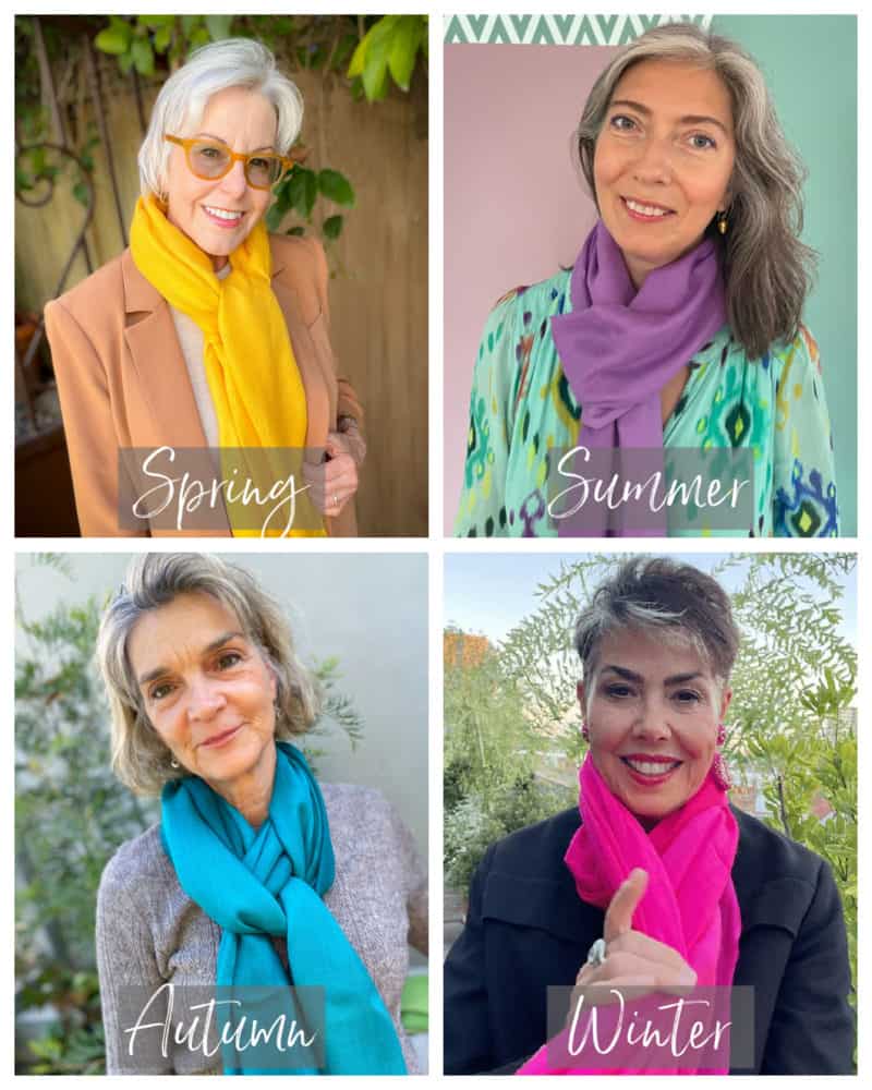
I’m delighted to introduce this collaboration with Red Leopard and Black: a collection of beautiful cashmere-silk scarves in seasonal color palettes!
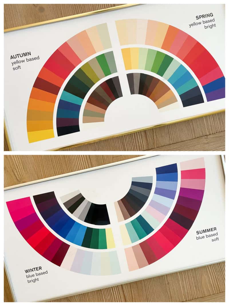
I’ve been sitting on this news since our visit to London in April. 😁 While there, I met up with Manina from Red Leopard and Toby from Black (a luxury accessories brand from the UK) to select colors for this exclusive scarf collection based on the seasonal color palettes. Red Leopard is where I had my own color analysis done in 2019, and where I received my training in color and style analysis earlier this year.
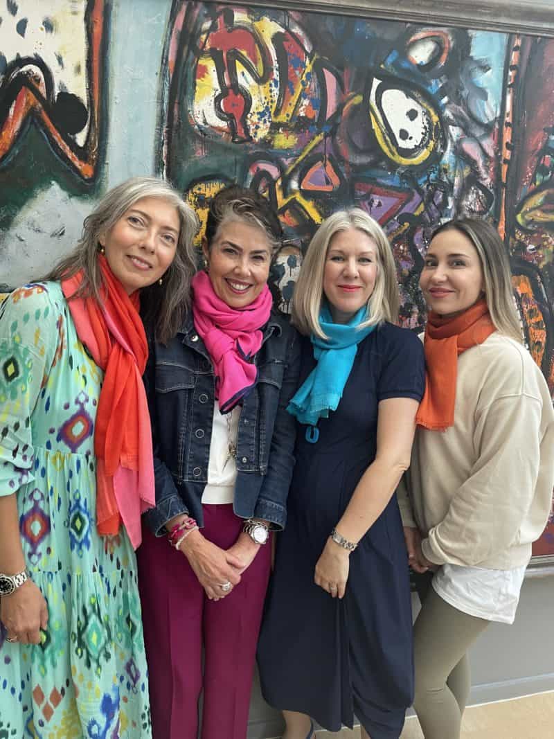
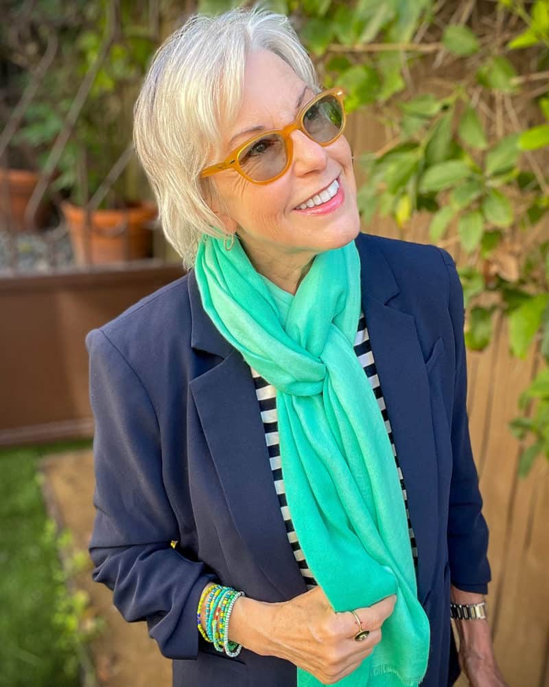
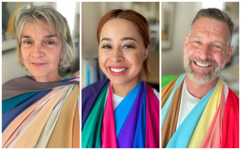
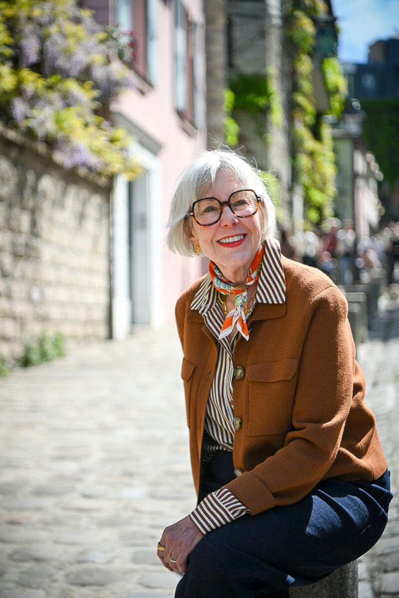
The scarves are even more gorgeous in person! There are three colors offered for each seasonal palette. Many of the colors have a “degradé” effect, which means they softly transition between shades of the same or similar colors.
Black has kindly offered my readers a 10% discount with code SUSAN10 !
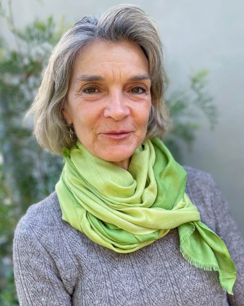
These scarves are soft and lightweight, and perfect for travel. (See how I wore my leopard print version last fall in Europe HERE.) I always pack several scarves to add color and variety, and to keep the chill off my neck!
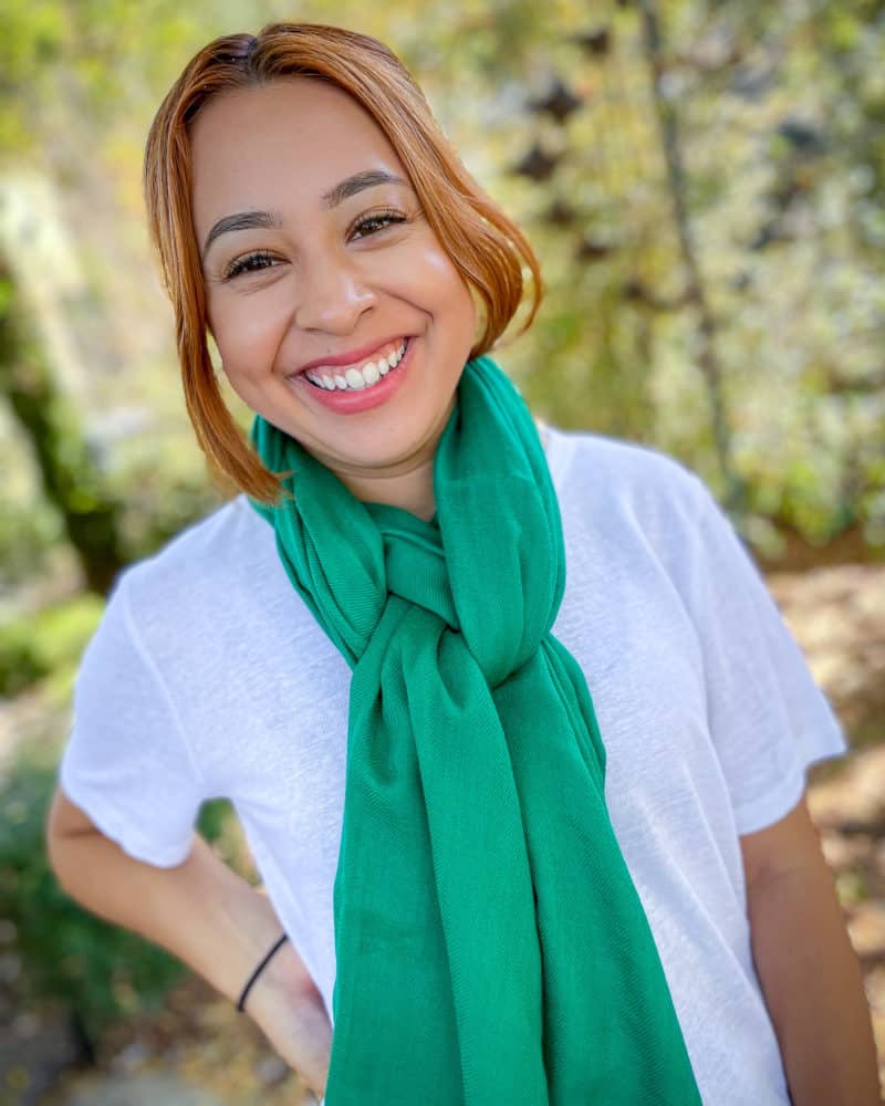
And as Manina explains in the video below, adding a scarf is one of the easiest and cost-effective ways to incorporate your best colors near your face.
Shipping to the US is free with orders over $175. These scarves would make lovely holiday gifts too. Don’t forget to use code SUSAN10
Here Manina and Rachel from Red Leopard explain a little about seasonal color palettes.
And some news of my own…
As I mentioned above, I completed a course in Personal Color Analysis with Red Leopard in February. It was a very intensive two-week course. I will now be accepting clients for in-person color analysis, beginning in October!
If you’re interested in having a personalized color analysis, please email me at [email protected], and include “Color Analysis” in the subject line. I’m launching the in-person color analysis services from my home “office” in the West Los Angeles area. If you live nearby or will be visiting, drop me a line!
I’m working on a web page with more information and scheduling, but in the meantime, please email me at [email protected] if you’d like to schedule a color analysis. (Please note, there’s a glitch in my email that sends an automated blank reply, am working on a fix. If you receive one, just disregard.)
And I have more collaborations with my Red Leopard friends coming up, so look for details in the next few weeks! 😉
Stay in touch
Sign up to be notified of new posts and updates from une femme d’un certain âge.
Congratulations on your new venture, Susan!
I would love to have you do my colors, however I have had two analyses done by two different schools and 20 years apart and remained a winter in both. I thought age might have made a difference, but for me it did not.
I REALLY notice a difference when I wear my colors, and have gradually weeded out the “not for me” colors and added only my good colors when purchasing new things. My closet makes me happy when I see the lovely colors in it.
Wow! Another role for which you have been unknowingly prepared over the years! Life just keeps on giving! I know you will do great. You go, Susan!
Congratulations on launching your new color analysis service! The scarves are lovely indeed. When I look at these seasonal color fans and perhaps they are the official Red Leopard ones, the colors all look somewhat faded to me. For instance I like to wear a true fuchsia and I don’t see one here. Is it a function of our screens or ???
Hi Penelope, fuchsia is absolutely one of the Winter colors. While it may not appear as vivid in the photo of my color wheel, it’s a clear & saturated color that looks stunning on many Winters.
Good for you! I was in the color analysis business for 15 years, mid 1970’s to late 1980’s. I loved the work, my clients, and public speaking.
I am a Winter. I would like your opinion: do Winters become Summer when they have gray hair? I think not, but I have found that some pastels look better on me that they did when my hair was very dark, and my level of contrast (dark/light) can be lessened or re-distributed.
Best wishes in your endeavor! Please reply of you have time!
Hi Patricia, generally one’s season doesn’t change, as it’s based on skin tone. However, a person’s “best” colors within the season may shift, or they may find that different combinations or contrast levels better suit.
Congratulations on your launch! I can endorse your sessions 100%:)
For the scarves, great idea, and they look beautiful. For me, I’d need one of the colors in Autumn/Summer to be more muted/browned, as I’ve realized that’s my real sweet spot.
Thanks, Lisa!
CONGRATULATIONS Susan! I just may make a pilgrimage to SoCal and make a day of you and Brian. Now, to a difficult subject and I don’t know if this holds true for every scarf from Black but I have ordered and received several and none of them looked like the photo on the web store. I would advise some caution as Black was not easy to work with and even though I took photos of what I had received compared to what was advertised, they were unwilling to let me return it (and it was expensive) and not very nice about it. So I gifted it to a friend for whom the colors worked.
I recently (last 6 months I think) ordered a scarf with Ukrainian colors to support Black’s effort to help and sure enough, the colors were not at all vibrant, but the cause was good.
Just make sure you read the return policy for any item.
Hi Susan,
I love your posts and I would love to have my color done. I haven’t had it done since the 80’s (when I was very young!). Are you able to do the analysis virtually? I live in Connecticut.
Thank you,
Laura Riley
Hi Laura, thanks! At this time I’m not doing online color analysis, but if I add it in the future, I’ll be sure to let everyone know.
I usually love the colours you wear, but I think that yellow scarf is not your best. Very harsh. Sorry
I agree. In fact, in looking at the color wheel, I don’t see that yellow shown in Susan’s colors. I’m confused as to whether colors can be reproduced accurately online.
Colors printed on paper (or viewed on monitors) often don’t appear as saturated as they do on fabrics. This scarf is close to the “Buttercup” color in my palette, just a little deeper. For some Springs it would be too yellow, but my best shades lean toward the yellowest end of the palette. It’s also close to the “Saffron” color from the Autumn palette, so Autumns could wear it too.
Just for the record, I think that yellow (which I realize may not be the best representation online), looks terrific on you, a testament to your warm spring coloring. Taste is subjective.
Gorgeous and ordered! Price is right and the shipping is very reasonable.
Congratulations! The scarves look really lovely! I am a blue paintbox spring and could probably more easily wear the autumn or winter colors pictured in the quartet than the yellow but I absolutely love the green scarf you are modelling!
Congratulations and so excited for this new venture! I hope I get to work with you. Just sent an email.
Scarves are beautiful!
The scarves are beautiful and I esp love the ones in my season, Winter.
I look forward to learning more — especially, as many readers have asked, how turning gray does not change things. I can see how the cool seasons evolve — but because the color gray is fundamentally a mix of black and white, I don’t understand how gray (or white or silver) hair or eyebrows (or beard!) doesn’t change our colors. Again, looking forward to learning more about this!
What a lovely new adventure. This suits you to a T. Best of luck.
Greetje