Food for thought: color analysis & why I still say, “tools, not rules”
Are you looking to refresh or refine your personal style over 50? It can sometimes be challenging to figure out what works or doesn’t for our changing lifestyles. Personal color analysis is one tool that can help you build and maintain a cohesive wardrobe in your best colors.
Helping women get dressed with ease and confidence has always been my mission and goal of writing this blog. I believe that deciding what to wear each day shouldn’t require the sartorial equivalent of solving a quadratic equation. To that end, I often share style guidelines and formulas that I’ve found helpful for building wardrobes and creating outfits. Guidelines are just that, though. They’re not meant to be solid lines that must never be crossed. That’s why one of my overriding style mantras is “tools, not rules.”
A powerful tool: seasonal color analysis
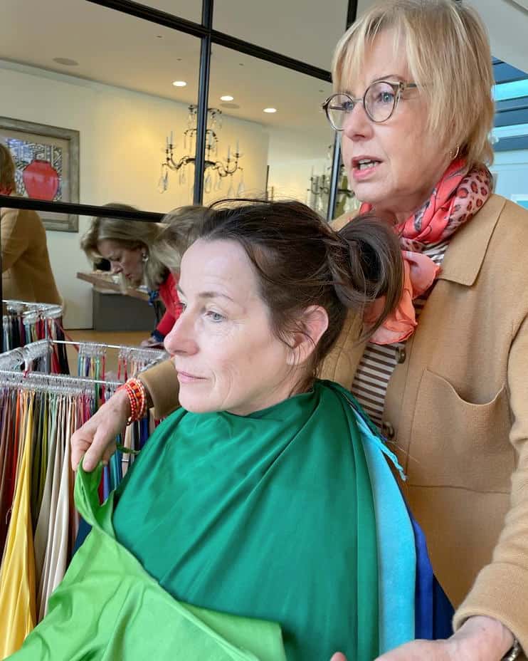
I became a believer in the power of finding and wearing your best colors in 2019, when I had a personal color analysis with Red Leopard in London. So much so, that I decided soon afterward to train with them as a color and style consultant. (Delayed by Covid, I was finally able to complete the training in early 2022.)
I’ve been working with clients since then, and some of the questions I’m asked most often are,
- “do I have to stop wearing [color X, usually black]?”
- “what if I hate the colors in my palette?”
- “do I have to wear ALL of these colors? I prefer neutrals.”
- “my best jewelry isn’t the right metal tone for my season, can I still wear it?”
In addition to wearing the colors that make us look our best, one of the top reasons to build a wardrobe in your seasonal color palette is that it creates cohesion. In other words, the individual items in your wardrobe work together in multiple combinations. Not only does that make getting dressed so much easier, but also saves money in the long run.
That said, I would never tell anyone to stop wearing something they absolutely love or that has personal meaning. Usually what happens is that once clients see the impact of their best colors vs. the rest, they want to incorporate those colors. And of course, you don’t have to wear anything you don’t like, though I have yet to have a client who doesn’t like ANY (or even most) of the colors in their seasonal palette.
“Cheating” on your color palette?
One of the first things Manina told me when she handed me the wallet with my Spring color palette was “don’t think you have to match every color exactly or you’ll never buy anything.” I find that many of my best/favorite pieces may be a little “off,” or in-between two colors in the palette.
And yes, I occasionally cheat a bit. I have some navy pieces that are darker than the Bright Navy in my Spring palette. I’ll sometimes veer slightly into the Autumn palette (also warm, but softer or richer than Spring colors). But I still follow a few of my own guidelines when I “deviate.”
- does the color in this item work with other pieces in my wardrobe?
- will I be wearing it close to my face?
- how much of the “wrong” color is in the piece?
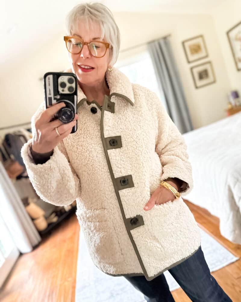
For example, this sherpa teddy jacket I purchased recently has trim that’s a bronze/olive from the Autumn palette. The main body of the jacket is Cream (which is in my palette). There’s not much of the trim, and what is there works with 90% of the rest of my wardrobe. And I love it, so for me, it’s a keeper. (It’s currently 30% off with code SHOPNOW )
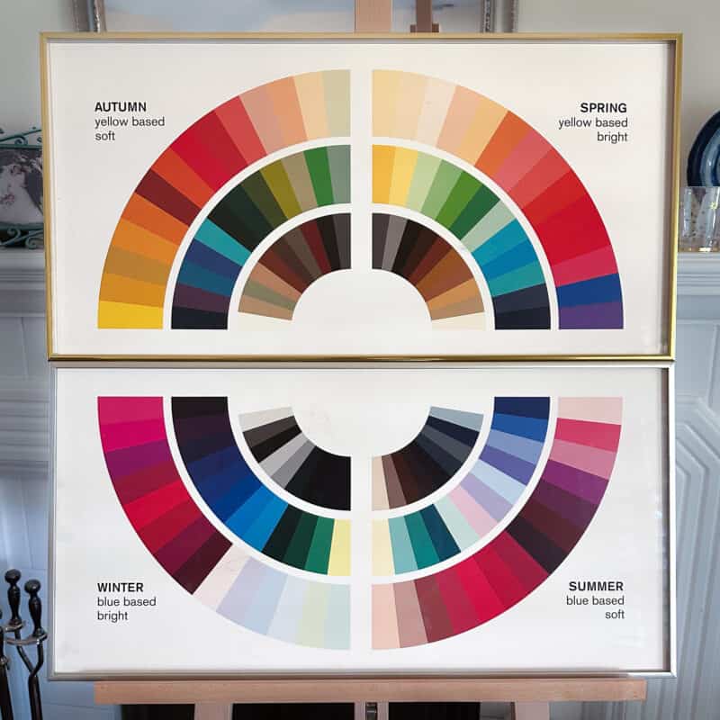
For the most part though, if you must cheat a little, I’d suggest sticking to your “half” of the color wheel (cool with cool, warm with warm). At least you’ll find it easier to harmonize with the rest of your wardrobe.
A note about jewelry and hardware: I still wear (and love) my Cartier Tank Française (purchsed secondhand several years ago). It’s stainless steel (cool) with gold accents. If you’re going to mix your metals, my suggestion would be to a) wear your seasonal metal tone nearest the face and/or b) include more of your best metal tone in the mix (e.g. two silver-toned pieces to one gold if your season is cool).
If you’re looking for ideas to refresh your fall wardrobe, check out my post The best fall fashion color trends for every seasonal palette. And did you know you can shop my favorites by your seasonal palette?
Shop Spring | Shop Summer | Shop Autumn | Shop Winter
Personal style tools, not rules
The bottom line is, seasonal color analysis or any other style guideline should be a tool that helps you, not a rule that constricts you. Style is very personal, and sometimes the best outfits incorporate personal tweaks that don’t follow the formula.
Which style and color guidelines do you follow, and which do you break?

Stay in touch
Sign up to be notified of new posts and updates from une femme d’un certain âge.
As a Winter, I occasionally wear tiny gold earrings and/or a gold necklace with a few items that work well with both gold or silver. But I wear my favorite signature chunky silver necklace constantly, and my husband is amused how often other women compliment when I wear it!
Hi Michelle! My Mom and I had our colors done in the late 1980s when Color Me Beautiful was popular. She was a Winter and I am a Light/Low-Contrast Summer. Color Me Beautiful remarked at the time that Winter’s primary colors–red, emerald green, royal blue, royal purple, and black–work equally well with gold jewelry as with silver. When I wear my reds, greens, blues, purples, and blacks, this is where I wear my gold jewelry. When I wear my truer Summer colors–the pinks, minty greens, soft blues, lavenders, and grays–I pretty much always wear those with silver, because gold just feels wrong. So I feel like if you like the golds, as Mom did, then you have a path for wearing them.
Susan,
Thank you for this helpful, timely information. I always enjoy your blog.
I recently had a color analysis and learned that I am a “paintbox spring”, even though typed as an autumn about 30 years ago.
Initially it was a bit overwhelming, but I find that I enjoy wearing the pretty clear brights closer to my face, along with neutrals that compliment my light brown hair.
I have streamlined my wardrobe and purchased some tops and wraps in my brighter pallet from Kettlewell (easy to order from the US).
Susan, I was one of those red/auburn haired individuals with a cool skin tone…Irish with rosy skin, not a warm skin tone. A long-ago color season analysis in my thirties didn’t help much and I was told to “just choose from all seasons.”
As I am graying, my hair is finally not fighting my skin tone and shopping is becoming much easier. However, I still feel myself drawn to the blues and greens of an Autumn and I wear much of my gold jewelry along with a few silver pieces.
I do struggle with choosing frames for my glasses. Any suggestions?
Hi Zizi, I’ve seen many clients who have “rosy” skin and turn out to be Autumns, but without actually draping you, I can’t know for sure. As far as choosing glasses, I’d say go with what complements your current wardrobe, which sounds like it may be mostly on the warmer side? If you want to go neutral, look at tortoiseshell frames.
I really enjoyed this post, and love “tools, not rules.” I’m not supposed to wear black, but have kept a few pieces just in case. I’ve been studying my best colors and use it as a guideline going forward. My wardrobe gets increasingly more cohesive, and I get increasingly confident.
The style ‘rule’ I sometimes break is wearing cool-toned “Lilly Pulitzer” items when on vacation to tropical locales! It’s just so wearable and uplifting for my spirit! Seems to me, they skew more ‘cool toned’ than my warm palette, so I combine it with gold jewelry and what has become my ‘signature’ color lipstick…a orange/coral with a bit of glimmer. I don’t feel magenta/hot pink works for me, but when I don MY LIP COLOR and my gold bracelets, I feel like Wonder Woman and can conquer the world!!
I do “cheat”. There’s a camel cardigan I love and have had for a long time so I wear white near my face. I’m a winter. Also because my skin tone is neutral I can get away with some gold jewelry. Yellow is in the winter palette. Recently I bought a pair of silver and gold earrings and this helps tie everything together when the other hardware I’m wearing has gold. This helps since most belts, bags, and buttons on sweaters are accented with gold.
Super helpful post. I even took a screenshot of the color wheel and added it to my “notes” on my devices. I like knowing I can play around with colors on my half of the wheel, if needed. Great advice. Cheers
Ditto! This is the first time I’ve heard this tip – thanks Susan! Now I understand why eucalyptus blue-green looks good near my grey hair.
I would appreciate your thought on this question . When I have tried a face foundation with a pink undertone, it always looks chalky. A warm foundation always works. Does this mean I am in the warm clothing palette? Always thought I was a spring, but when my hair grayed, I got thrown off.
Thanks so much. It’s not feasible for me to have a color analysis done by you. If it were, such fun!
Hi Barbara, makeup colors aren’t a reliable way to determine a person’s seasonal palette. As season is determined based on skin tone, one’s season doesn’t change when hair goes gray. However an individual’s best colors *within* the palette (or combinations of colors/contrast levels) may shift.
The chalky undertone is from Titanium Dioxide, the ingredient that makes a makeup cover flaws. Pink enhances it. Try a tinted moisturizer instead. Little to no TiO2 to worry about.
>>One of the top reasons to build a wardrobe in your seasonal color palette is that it creates cohesion. In other words, the individual items in your wardrobe work together in multiple combinations.
You are so right about this! As I looked in my closet last week, I saw that my small wardrobe looked cohesive and complementary — except for that one orange tunic, which I purchased in the spring and have not worn at all. I’m a Winter, there’s no orange in my palette, but I occasionally try anyway, LOL.
I am a summer but sometimes wear black. For some reason I can wear high contrast. I used to model and one of my regular employers always saved the bright colors for me to wear down the runway. When I look at the color wheel in the post and the ones Red Leopard shows, the colors all look muted/ muddy to me. Perhaps it is the monitor?
Susan, I want to start off by saying how much I look forward to your blog articles. It’s a nice break to stop by and read your thoughts a few times each week. I especially like to find you on a Saturday morning and “catch up” via your blog.
The color analysis stuff is fun, and helpful advice. I am thankful that you are emphasizing freedom and flexibility in dressing. It is supposed to be fun. Not everything will be a hit, but we experiment and learn as we go.
Last weekend I walked into the Goodwill (dropping off closet discards) and I found a brown Talbots blazer that I’m going to try. Almost exactly like your lady blazer but with a collar. Fun! I also found a basic mustard sweater, and I am looking into adding some rust/orange tops and I’m browsing tortoiseshell or horn jewelry for a fall refresh. I also bought a pair of dark navy loafers with some brown on the sole but I don’t know if they will work or not.
But, this is part of the exploration. I still need to work on sorting my closet and I have not yet put away the summer shorts and taken out the heavy winter wear. Soon it will be too cold for even loafers and time to get into boot season.
I really enjoy reading about color palettes. When I look at my closet most of the colors are in the cool range. I like colors in the mid-range of saturation – neither too dark nor too pale.
One guideline I follow is my reaction when I try something on. If it makes me happy, whether it is “by the rules” correct, I go with it!
I started to seriously follow my color guidelines about 3 years ago when I had a color refresh and received pretty much the same results I received 30 years ago. Using color as the primary reason for purchasing clothing though resulted in some items that I never wore. Since having a style analysis I am much more conscious of the styles that are best for me and that I will wear often. I deviate though for jewelry. I am an autumn and I still wear my silver artist-made jewelry though not as often. It seems to go best with the teal and marine blue shades.
I wanted to wish you and your jeunne homme a meaningful Rosh Hashana. I know it will be different from prior years but I hope it gives you peace.
I am a huge believer in the seasonal color analysis system since I did it with you last December! My wardrobe is so much more cohesive now. Getting dressed, and packing for travel, is so much easier and less stressful. I carry my seasonal color wallet with me whenever I go shopping. It was a great investment for my wardrobe!
You are right. Having a colour analysis was one of the best things I ever did (style wise). I already knew a lot but not that yellow and orange are good colours for me and jeans colour near my face is really bad. Most of the times I follow these guidelines and sometimes I just wear black and white haha (my worst colours). But if I do, I almost always wear a bright colour with it. For instance a scarf or earrings.
Greetje
Dear Susan,
In my recent color analysis session with you, I learned I was a winter after being told I was a summer decades ago. At first, I felt daunted by the bold winter palette. However, I already feel more confident and comfortable when wearing my best colors. I incorporate the warm and cool shades of gold in an heirloom bracelet that includes both. Mixing and matching flows easily now that I understand the complementary and compatible colors in my palette. The entire experience “sparked joy”. Shopping expeditions are no longer daunting but exciting. Thank you for a life enhancing experience.
Hello Susan!
I always look forward to your helpful, thoughtful posts. I was wondering if you would consider doing a video/tutorial on Gamine style (perhaps in collaboration with Manina from Red Leopard)? I am a Gamine and would love to get a better idea of the various types of Gamine style.
Thank you again for your wonderful posts and I wish you all the best!