Trying something new: I’m warming up to this color combo…
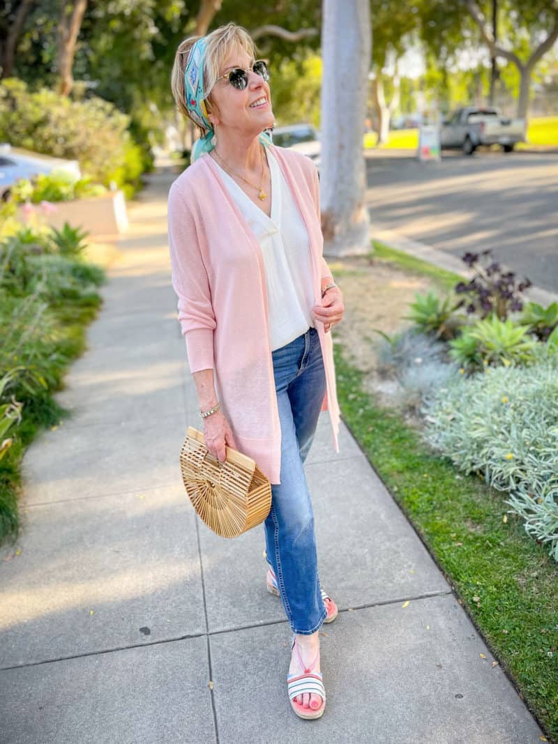
I’ve always balked at wearing light pink, for a couple of reasons. First, I believed that it washed me out (more on this in a moment) and second, because certain pinks have always felt a bit…insipid to me. But I’ve been re-thinking that…
scarf (similar colors) | top (plus) | necklace | cardigan (plus)
bracelet | bag (similar) | jeans | sandals
(Sizes: cardigan – Petite Small, jeans – 27P, top XS)
When I had my color analysis, I was surprised to learn that some of my best colors were in the pink family. Including this light salmon pink! (The color of this linen blend cardigan is listed as “Pink chintz” on the website. This color is also offered in a shorter, button-front cardigan if you prefer that style. Plus HERE.)
I’m thinking this light pink could almost function as a neutral in my wardrobe, an alternative to beige. So as a color accent, I’ve added a small silk scarf worn as a headband.

A pink and blue summer outfit
The scarf is a vintage Chanel 70cm silk square, purchased second-hand several years ago. I love wearing it as a headband! A bandana-sized scarf is perfect for for this, or tied around a pony tail, or as a hat band. Scarves are such a great way to add your best colors near the face, and I’m happy to find a way to wear them in warmer seasons.
Pink and blue is a color combo I’ve usually avoided, as it can make me feel like a walking baby shower. 😂 🍼 But the combo works for me here, as the blue is more vibrant/saturated and warmer, leaning toward aqua. I never would have thought to wear these colors together before my color analysis. But one thing I’ve realized is that working from my Spring color palette when shopping results in a wardrobe that is more cohesive. These colors fall into goes-together-doesn’t-match territory.
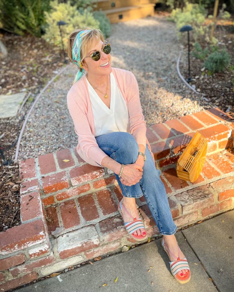
And to add some serendipity to the mix, both colors are echoed in these striped espadrille sandals. (A new favorite, and VERY comfortable!)
Have you tried any new color combinations lately?

Stay in touch
Sign up to be notified of new posts and updates from une femme d’un certain âge.

Love this look on you Susan! May I ask what size you are wearing in the sweater (misses or petite)? Thanks
Thanks, Treva! I’m wearing Petite Small.
Susan, that pink is a delightful color on you! Adding that Aqua is a clever addition. Well done!
Thanks, Joan!
This look is very light and refreshing. It looks great on you. I love pink and blue in the right hue (HeHe!). I’m not a lover of yellow (I lean cool), but a light lemon yellow with a cobalt blue is a combo I like wearing. I also like coppery brown (pinkish) with deep blue and pink or pinky peach with green (cool or balanced green). This last combo seems very 1960s mod to me, which I like.
Hi SuD, thanks, and all of your combos sound fabulous.
I like to put light pink with deep dark yellow, but not when the temperature is 100 degrees. Then I’m a white + pink person.
Hi Rose, I agree when it’s hot it just feels better to wear lighter colors. (Fortunately we’ve been spared the extreme heat so far, fingers crossed.)
Just wanted to thank you for doing my summer shopping for me. Our coloring is very similar, so it’s easy to look to you for inspiration. I’ve had a hard time finding flattering colors that are not in the pale turquoise/green spectrum, so this is a great addition. I hope you get a big commission from my purchases!
LOL, happy to be of assistance! 😉
I agree the pink looks lovely on you! Also want to mention how much I enjoy the videos you do with the other bloggers.
Thanks Sandy! We really enjoy doing them!
Susan, you look fabulous as always. A few questions about color analysis, when you had your done, did they cover your hair? Will your season still be spring if and when you stop coloring your hair. And are you growing your hair out? What style, can you pos some pics? Thanks!
Hi Arlene, yes they covered my hair. And yes, my season will still be Spring, even if I stop coloring. This video with the Red Leopard team talks about hair color and color palettes in some depth: https://www.instagram.com/p/CQJuXlbnAlS/
Thanks! It was a very informative video>
This pink makes you glow!
Thank you!
That pink looks great on you!
Do you or anyone have a resource guide for a packing list for a year away in the south of France? All in under 50 lbs of luggage?
Thanks! Personally, my advice would be to pack for the first season you’ll be there, plus a few season-spanning basics and layers (e.g. lightweight cashmere) and plan to do some shopping for the rest. Head to the local market or nearest Monoprix for more budget-friendly options.
Perhaps some of my readers who live in or visit the South of France often can chime in.
Hi Susan, lovely color combo on lovely you! The Red Leopard Instagram was great and, would you be willing to recommend a color analysis
person in the San Francisco Bay Area? I turned 70 and would really like to enter this decade with enthusiastic style 🙂
Huge thanks for your constant inspiration!
Hi Kerrie, thanks so much! Here’s a link to find a House of Colour image consultant in your area: https://www.houseofcolour.com/find-a-consultant/
This is the color system I was analyzed in.
Wonderful!!!! Bouquets thanks Susan❤️ Because of you, I’m greeting my 70s with curiosity and adventure!
This looks great on you! And so comfortable yet pulled together! I, like, am not much of a pink person, never felt it was a good color for me besides, but tried on a top at a salesperson’s suggestion and feel it is one of the most flattering tops I own! Who knew?! I guess we really shouldn’t prejudge! Lol!
Thanks Margot! I try to strike that balance between knowing what works for me and keeping an open mind. Sometimes you surprise yourself!
Love the pink on you. And the touch of aqua is perfect. I hope you can talk Red Leopard to come out to Southern California. I’d sign up in a minute.
Thanks, Cindylou! I know everyone’s travel plans are still a bit fluid at this point, but I am hoping to be trained by them later this year…
I understand what you mean about insipid pinks. The colour of pink you are wearing does that to me but that’s where knowing which shade of pink works best. On me a cool bright pink or one that has a blue-ish cast works best. Anything that leans to peach, warm coral or salmon does not work for my skin tones. I recently purchased a lovely pale pink cashmere sweater that is most unflattering. Not because it is a warm pink but because it is so very close to my skin colour. Solution is to wear a high contrast scarf that incorporates the pink. As a child my very artistic parents refused to dress me in pastel pink or blue. With my fair skin, very dark hair and blue eyes one would think baby blue/ pink would look adorable. My parents found that bright yellow, reds, emerald green even black looked best on their baby girl. They were correct in sensing that higher contrast worked for me better than the ubiquitous pastels so prevalent in girl’s clothing in the 50’s and 60’s. The serious debates held at the dinner table over my sartorial health and welfare were, in retrospect, hilarious! Often their artistic friends would be sought out for their opinions too….. some more concerned with design then colour, and another charged discussion would ensue …rather ironic that the source of all this debate ended up in health sciences!!
On you Susan the look is lovely and those espadrilles, wonderful!
It sounds like your artist parents gave you a good grounding in color theory, and that you’ve put it to good use!
I think orange in a scarf could look pretty with the pink and bring vibrancy just like the lovely teal hair scarf does. Those colors from the sandals and your toes look so complimentary! The sandals are very tempting!!!
Love that idea, thanks Janis!
Never say never! You look great !
Thanks, Anne!
You look lovely.
Thanks very much!
How did you go about having your color analysis done?
Hi Susan, I wrote about it here: A Style Reset With Red Leopard It was one of the best style investments I’ve ever made!
Fabulous, Susan. Pretty in pink, indeed.
Thanks very much, Kristi!
I love love love this outfit, this colour combination. I would never have thought about it either. I did my colour analysis 25 years ago but never got tips like “goes together but doesn’t match”. Brilliant.
Greetje
Thanks, Greetje! It’s been fun to experiment with different color combinations.
Susan, I love that scarf as headband on you! I may try that as the heat and humidity has wrecked my hair!
Thanks, Francoise!
You are finally getting around to my favorite color. I love pink! I self analyzed as a Summer, only to realize that (1) cool pink made me feel uncomfortable and (2) I had a closet full of warm pink and melon clothes that I loved to wear. So I have now settled comfortably into the Spring camp.
I love the color of that sweater on you, especially with the blue accent. I see that you have been unable to abandon your long-over-lean despite your style analysis. But it’s probably a more youthful look than the button-up cardigan (which is my mainstay.)
Thanks, Lyn! My style analysis didn’t preclude a long-over-lean look, just gave me some guidelines on proportions. It’s still my favorite silhouette and such an easy one to wear!
I have that sweater in black and rust (I think on your recommendation a couple years ago) and they are my travel go-to buddies, as well as at home. Seeing the pink on you makes me consider whether I need that one too. It looks great on you.
Thanks, I really love these sweaters. I’m hoping they add more colors (maybe for the Anniversary Sale 😉 )
Insipid? Curious idea.
defined as “lacking vigor or interest”
Loving your posts even more since I have learned that we share similar characteristics and coloring.
I am also 5ft1in tall and have a full bust (DD). So proportion is always a huge consideration. Love this
Look on you. I have used soft pink as my main neutral for many years – have been wearing a pink ceramic
Watch for the last 12 years and always receive compliments – also have incorporated pink quartz jewelry
pieces which are also frequently complimented. Look forward to your continuing evolution! Have a blessed
day.
Thanks so much, Tracy!
I love it!!
Thanks!
Have 3 of those linen cardigans. And I had but gave away the pink one you’re wearing a couple years ago when I decided I had too much pink in my closet. Those sweaters are perfect when wool is too hot. They are on sale occasionally too.
I gave away a rust one a couple of years ago and am still kicking myself!!!
You look lovely in the soft pink cardigan. It really suits you.
Thanks so much, Josephine!
I really like your outfit. It looks refreshing.
Thank you, Claudette!
Hi Susan, I love the blouse you’re wearing. It looks casual and polished at the same time. Can you tell me how sheer it is? Do you need to wear anything underneath?
Thank you,
Amanda
Hi Amanda, thanks! It’s a lightweight fabric, but not what I consider “sheer.” I feel perfectly comfortable wearing without a camisole underneath.
Pink in just the right shade is a wonderful alternative to beige, for those is us who look ghastly in all things earth tone. Some people hate pink. These are usually people who look good in beige.
I’m 78 years old. Is it too late to have my colors and style done?
Not at all! It’s a great way to bring focus your style.